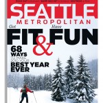
I thought I’d take a break from the February issue to share some stuff from Seattle Met‘s January issue: Get Fit & Have Fun: 68 Ways to Make 2010 Your Best Year Ever.
I designed the Mudroom’s opening article to look like a missing pets flyer. First I used image boxes and rules in InDesign to set up the size of the paper and where the tears should be. Then I printed out that page, traced it onto a blank piece of paper, trimmed and tore that blank piece of paper according to my markers, photographed it, cleaned it up, colored it in Photoshop and brought it back into InDesign:
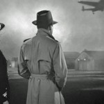
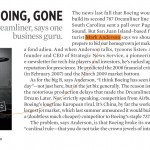
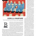
I hired my buddy Ryan Olbrysh to illustrate this article about Boeing leaving town. (Ryan has my old job art directing Las Vegas Weekly.) I asked him to reference the final scene in Casablanca for this:
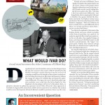
I consider this a good example of making the most out of provided artwork. For this article about the elaborate Ivar’s billboard hoax, I used an old photo of Ivar and made it look like he was dreaming up the hoax himself. I added the surfacing drop cap as a final touch.
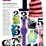
I redesigned our products page to give it more scale and energy:
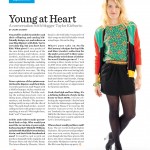
Made some modifications to the style page:
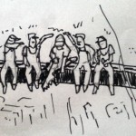
I commissioned David Plunkert to illustrate this Powerlines illustration. But first I sent him a sketch of my concept:
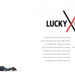
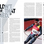
For the opening spread of the profile of Scott Macartney, an Alpine racer who nearly died in one of the worst crashes in World Cup history, I wanted something stark, cold and unsettling. I found this photo of him just after the crash and set it against an empty background:
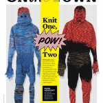
I had fun working with these provided shots of knitted superhero costumes:
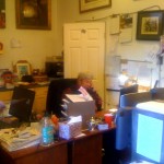
I hope to check out that exhibit during my best year ever. One last thing: I snapped this photo on Christmas Eve in Las Vegas, when I took my nephew to the shop where they film Pawn Stars, my current favorite TV show. It’s the Old Man hard at work:

