I’m really lucky to have my homeward bus stop right in front of the Seattle Art Museum (SAM). I love looking at the promotional material they come up with for their exhibitions — I’m assuming it’s done in-house. They use Gotham for their logo and for all of their collateral, and passing it everyday influenced my decision to bring Gotham into Seattle Met at the end of 2009. (I’d brought Gotham into Las Vegas Weekly back in 2004, but, frustrated by its width, replaced it in my 2007 redesign. But Gotham was modified with Narrow and Extra Narrow widths in 2009, which, along with Gotham Rounded, I also brought into Seattle Met.)
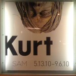
I left work late Monday night and was greeted with this captivating new poster for the upcoming Kurt Cobain-themed exhibit.
I love the upside-down placement of that creepy statue, and the extreme left alignment of “Kurt” with the chopped K, and the overall starkness of this monochromatic design. This is my favorite SAM poster yet, and I can’t wait to see the exhibit.


