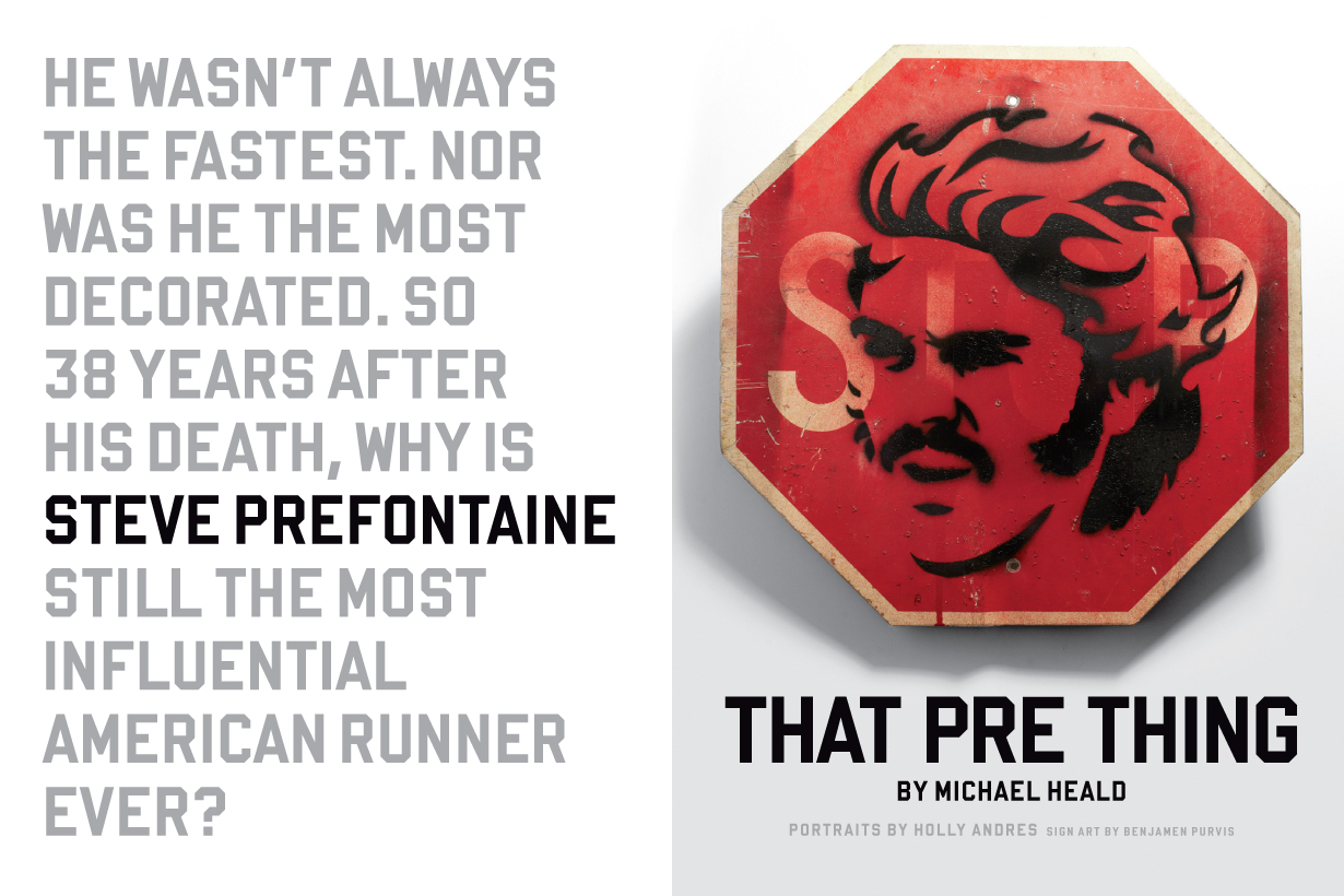
That’s the stencil I made for the opener of the April 2013 Runner’s World feature, “That Pre Thing” — an epic story about why 1970s runner Steve Prefontaine still matters nearly 40 years after his death at age 24.
I was only vaguely aware of Pre before I read this feature. About ten year ago, as a fan of director Steve James’s documentary Hoop Dreams (and later Stevie, one of my all-time favorite movies), I rented his film Prefontaine. But I stopped watching it after only a few minutes, when I realized it wasn’t a documentary.
Soon after accepting the design director job at Runner’s World last summer, and before my first day at work, I stopped in a running store in Manhattan, and saw on its back wall a poster of Pre in a STOP PRE t-shirt. I thought it was really cool, and made a mental note of that image, should I ever have to do something on Pre in the future:
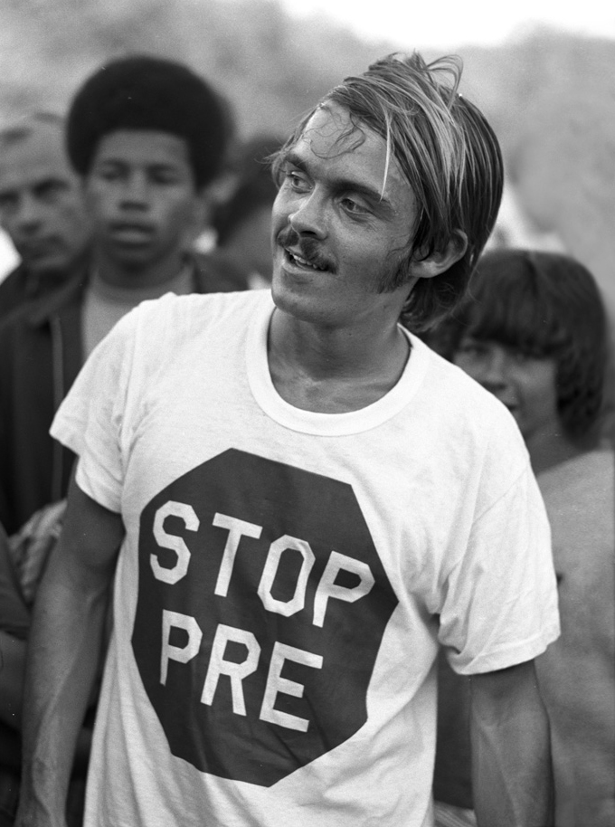
(This t-shirt was made by a fan, as a response to the Go Pre! signs that were popular at Pre’s races.)
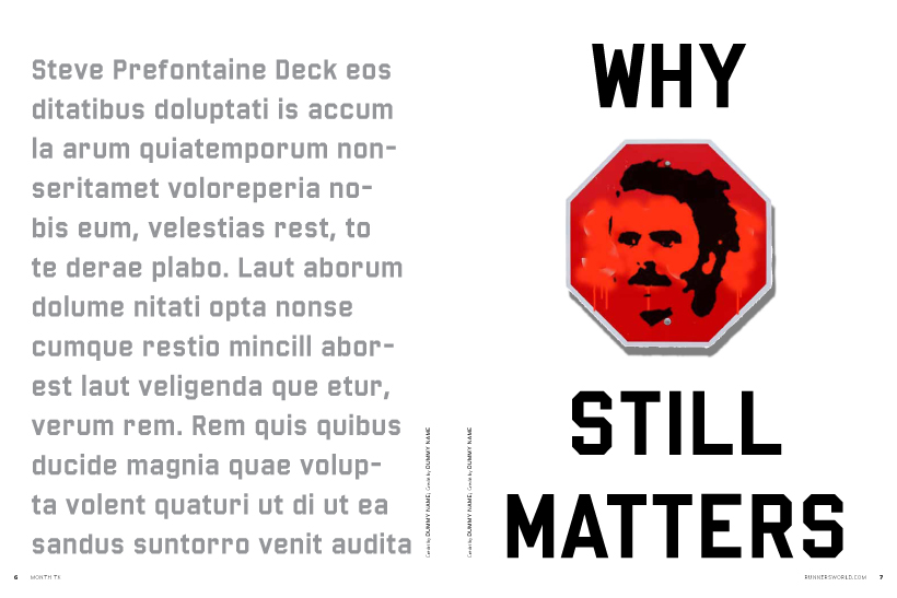
When I learned that the April 2013 issue would include a lengthy feature on why Pre still matters today, I thought of that image. I hadn’t yet received the text, but I knew I wanted something bold and unique to Runner’s World for the feature opener. I started messing around in InDesign, then in Photoshop, and came up with an idea of a stop sign vandalized with a spray-painted image of Pre on it. I emailed the sketch to my editors and sold them on the idea:
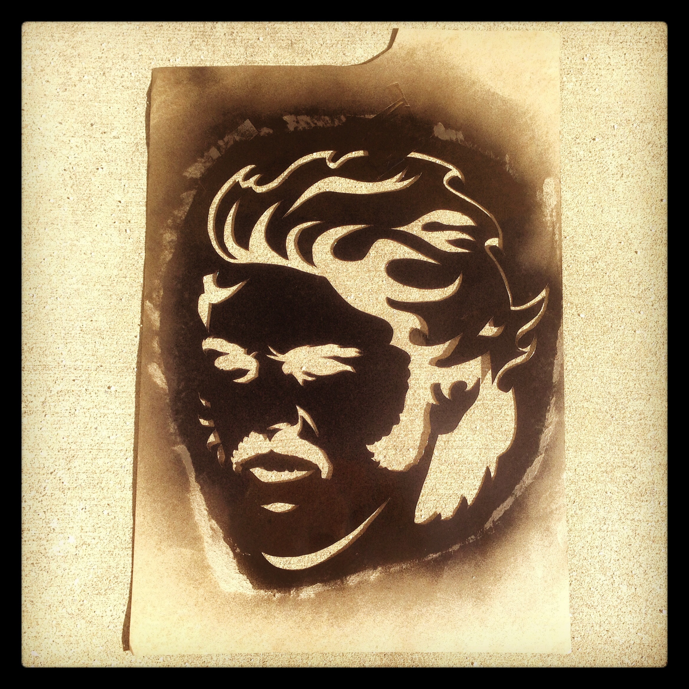
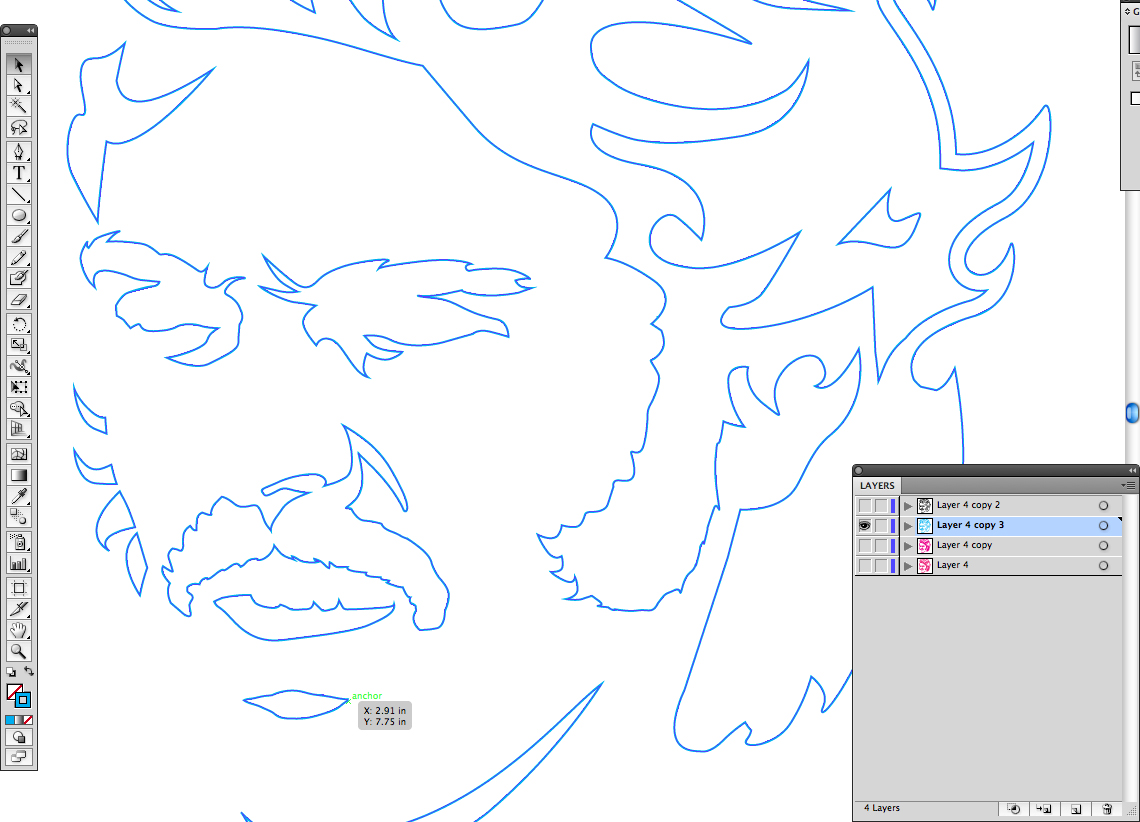
We always use top-notch illustrators in Runner’s World, and I could’ve easily commissioned one for this assignment. But I really wanted to do it myself. I drew my stencil in Illustrator, basing it on about four different Pre photos. Although his hair was very smooth and straight in real life, I embellished mine, and made it wild and fiery:
A coworker volunteered a battered old stop sign that he’d kept in his basement for over 20 years:
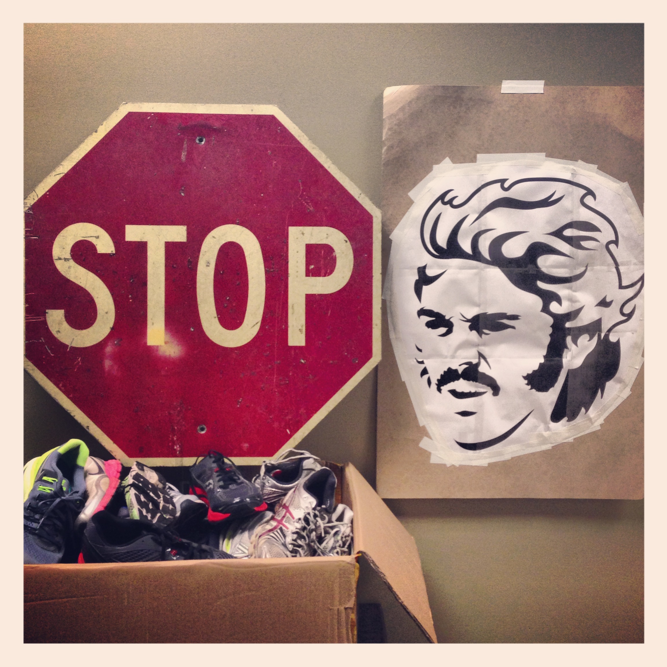
Once I mounted and cut out my stencil, I tested it out on the back of the stop sign in my frigid garage (it was January):
I was thrilled with the results. I’d never made this kind of thing before.
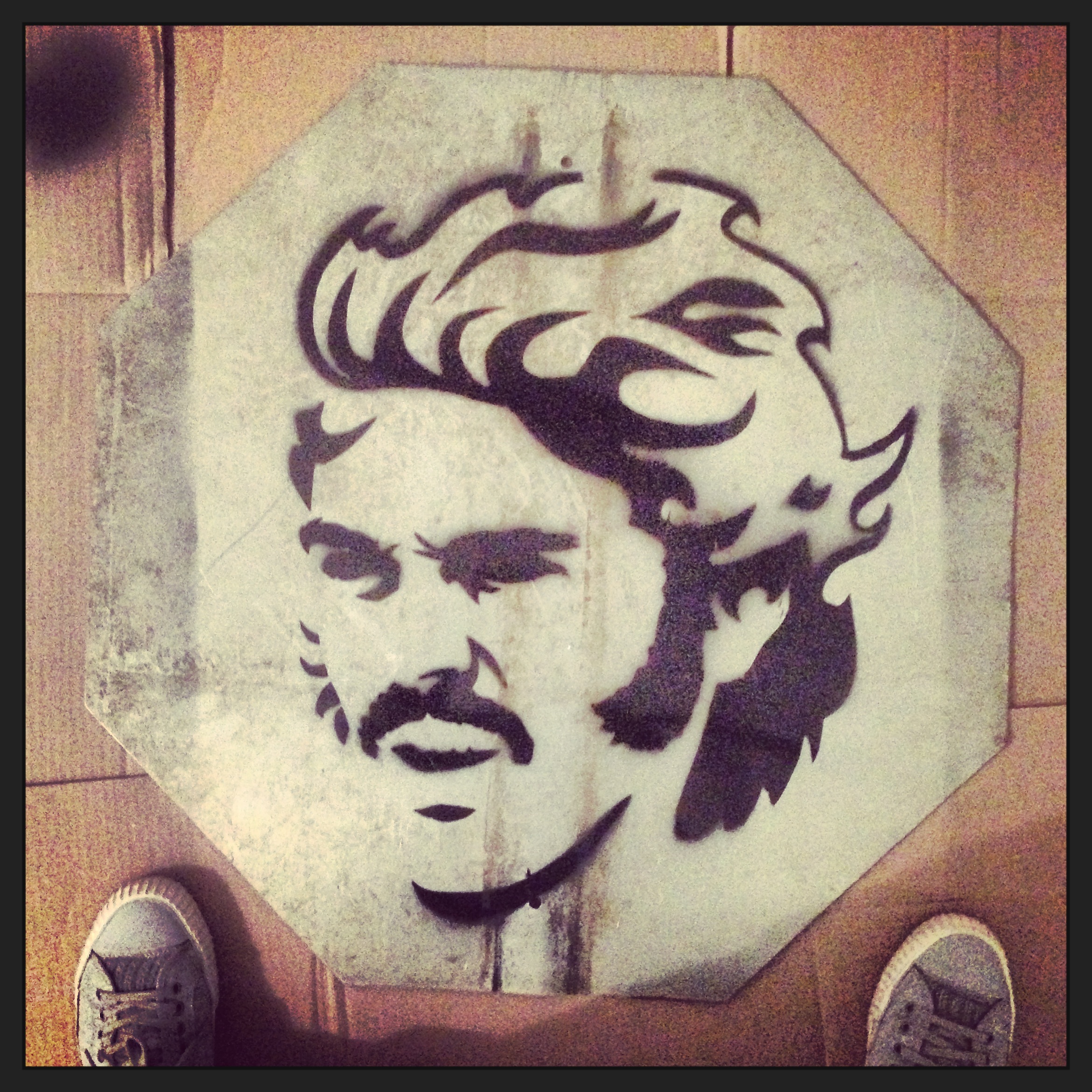
Later I flipped it over and sprayed the front. (But before that I knocked out some of the white lettering with red spray paint.) I let it dry overnight in a toasty, ventilated bathroom, but not before snapping a photo and posting it to my Instagram account:

The next morning — Pre’s birthday, coincidentally — RunnerSpace grabbed the photo from my Instagram account and posted it on theirs (with a credit to me). It was great to see all the Likes and positive comments add up so quickly. Other people started posting it to their accounts, and even applying new filters to it. It was amusing to see my PF Flyers show up in the Instagram galleries of strangers, in photos with the hashtag #stoppre.
My managing editor went one step further and made a hasty STOP BEN sign in Photoshop:

A Rodale staff photographer snapped a shot of my sign in the studio. Here’s how my opening spread turned out:
It’s the first time I’ve given myself an art credit in two years.
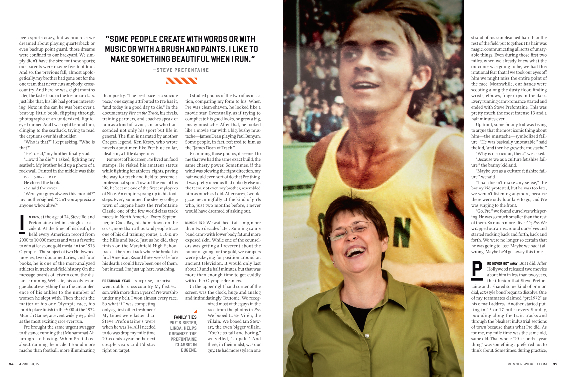
Photographer Holly Andres photographed Pre’s sister, some of his old friends, and runners inspired by his legacy today. My request was to have Pre represented somehow in every portrait. In many it was through t-shirts or framed photos. In the case of Pre’s sister, it meant shooting at a store that had a massive photo of him covering one of their walls:
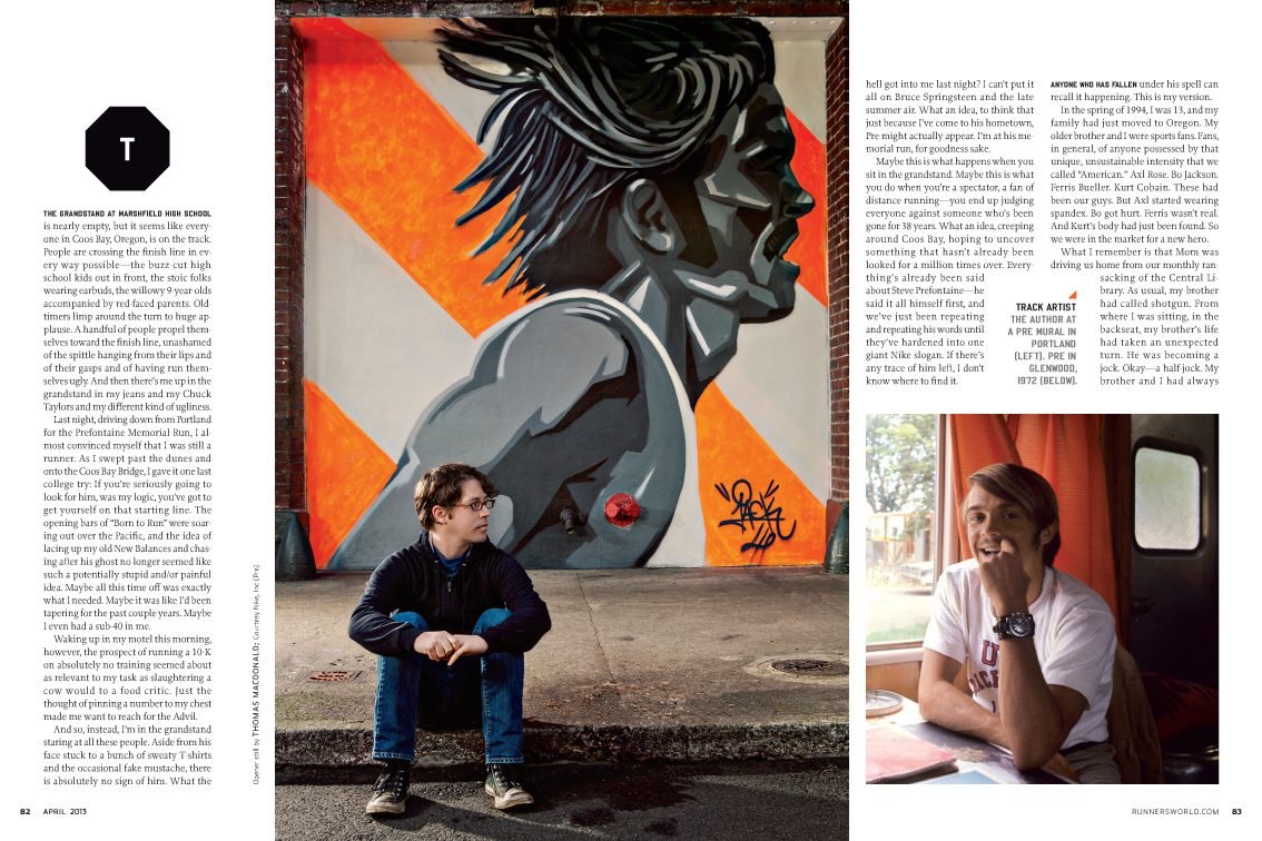
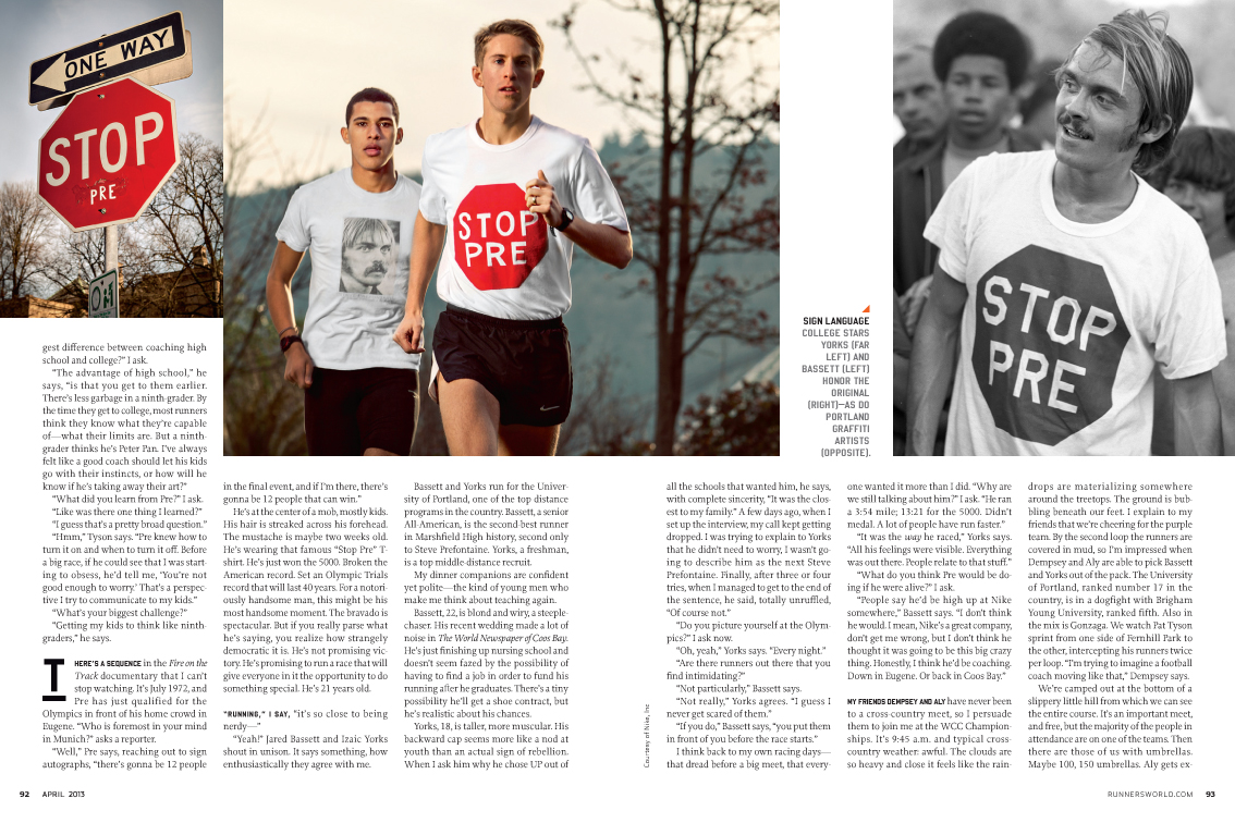
 That #stoppre Instagram hashtag led me to discovering a stylish outdoor mural of Pre that I thought would make for a fantastic backdrop for the writer’s portrait. My photo director Michele put out a query on Facebook, and immediately heard back from a Wired staffer, who shared the exact location of the mural (in Portland, OR).
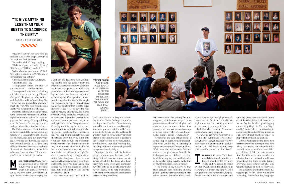
I decided that subjects with open eyes would be looking off at vintage photos of Pre in my layout:
The #stoppre hashtag led us to one other discovery: a stop sign that was vandalized with Pre’s name on it. It was right around the corner from the mural. We included it, along with a young runner in a custom-made STOP PRE t-shirt, in a spread showing the legacy of the original photo that I first saw at that Manhattan running store:
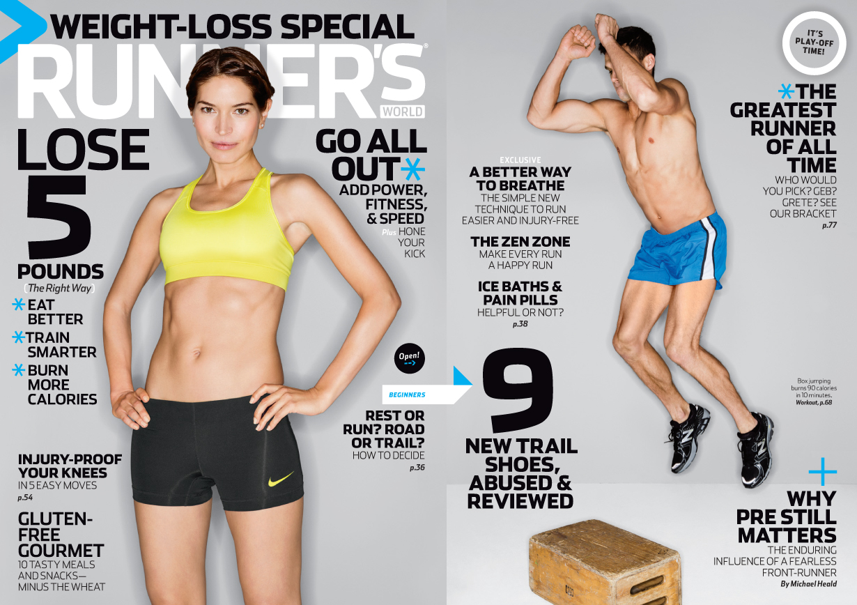
Here’s the cover of the April 2013 issue — another gatefold, photographed once again by Guido Vitti:
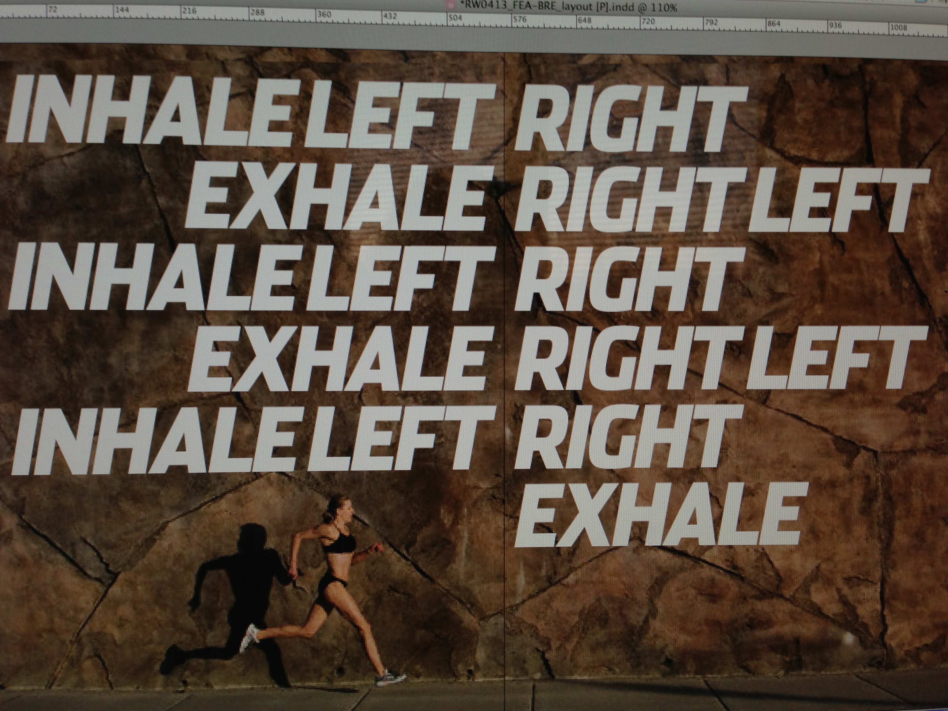
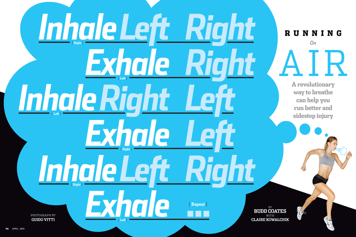
There’s a feature in the issue about a better way to breathe when running. In the initial meeting where I first heard about this article, the editor described the technique, with its inhale-exhale, left-right rhythm. I immediately pictured that rhythm spelled out large above a runner, and soon got to work on an opener idea. Here’s an in-progess first draft, using a stock image as a placeholder:
I later tried stripping the runner from the background, and treating the text a little differently. In my notebook I wrote down the correct order of the inhale-exhale/foot strike rhythm, since I’d had it wrong all along:
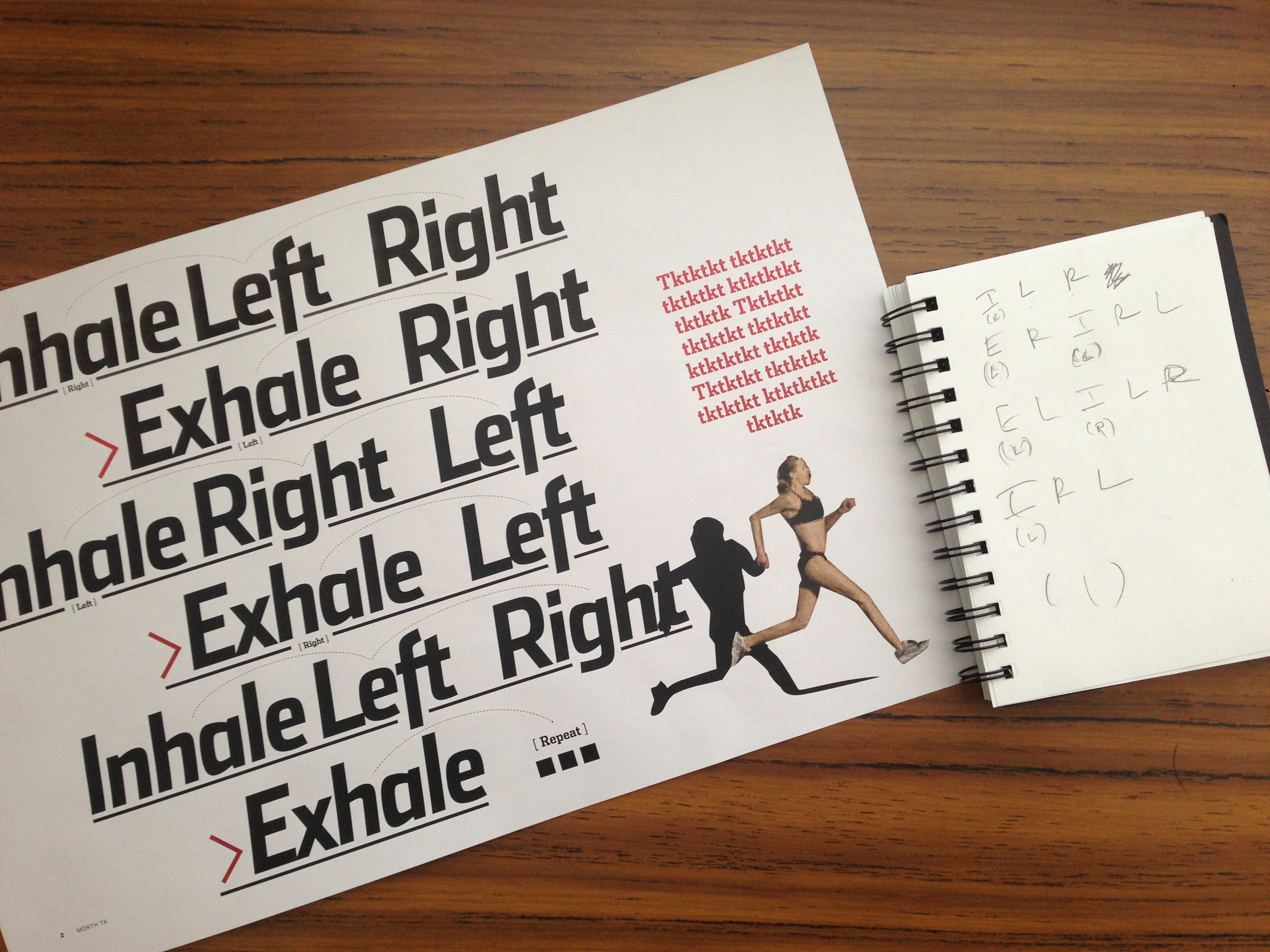
Here’s how my final version turned out:


I would LOVE to have a print of that stop sign. That thing is incredibly awesome.
I really like the stencil you made, could you send a printable version to me?or better yet post one?