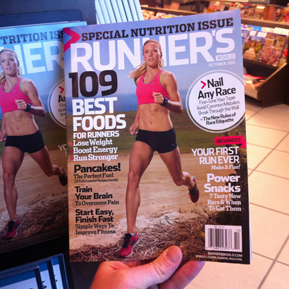


Check out those great covers from 40 years ago. I saw those piled up on a desk at the office and had to snap some photos for myself.
I have to admit, I’d never picked up a copy of Runner’s World before interviewing for the Design Director position back in June. I’m not a runner — although I’m hoping my new job will help change that — so I never really felt compelled to flip through it. But after an initial phone interview with Editor-in-Chief David Willey, I had the 12 most recent issues of the magazine FedExed to me, so that I could check them out and have at least a loosely informed conversation during my in-person interview a few days later. And after getting a better sense of Runner’s World, I was really excited about the content, and the places I could potentially go with it.
My first day on the job came just two weeks after flipping through the magazine for the first time, but I didn’t sweat it too much. The topic of the magazine may be new territory for me, but it contains the two basic elements I always latch onto for inspiration in my work: drama and humor. And I knew the editors were really excited to try different creative approaches to the content.
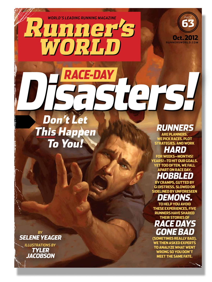
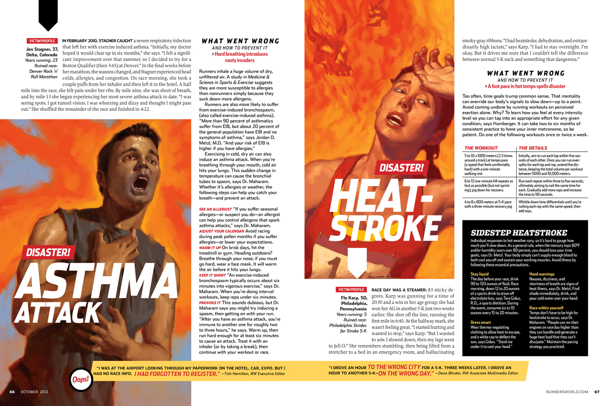
One of the first service features I began working on was about race days gone terribly wrong. It was called “Race Day Disasters!” — and that “Disasters!” immediately grabbed me. It made me think of vintage men’s magazine covers, like the ones in this Instagram photo of my desk:

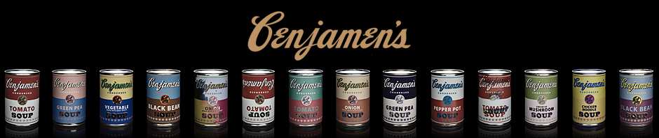
Or these, which I snapped at an antique store in Columbia, PA:

(I rearranged the vendor’s display so that my shot would look better.)
I commissioned Tyler Jacobson, whom I’d worked with once before at Men’s Journal, and who I knew would do something really exciting with this genre. I loaded him up with concepts and examples, and asked him to play up the pulpy melodrama in his paintings. And to use a lot of red and yellow.
I designed a feature opener using only the magazine’s standard fonts, then added scratches from my personal collection. Nine years ago, I scanned the then-battered paperback dictionary I’d gotten new for Christmas back in seventh grade — I’d actually asked for it as a present — and I’ve used it in about a dozen different published pieces over the years.
Here’s the opener:
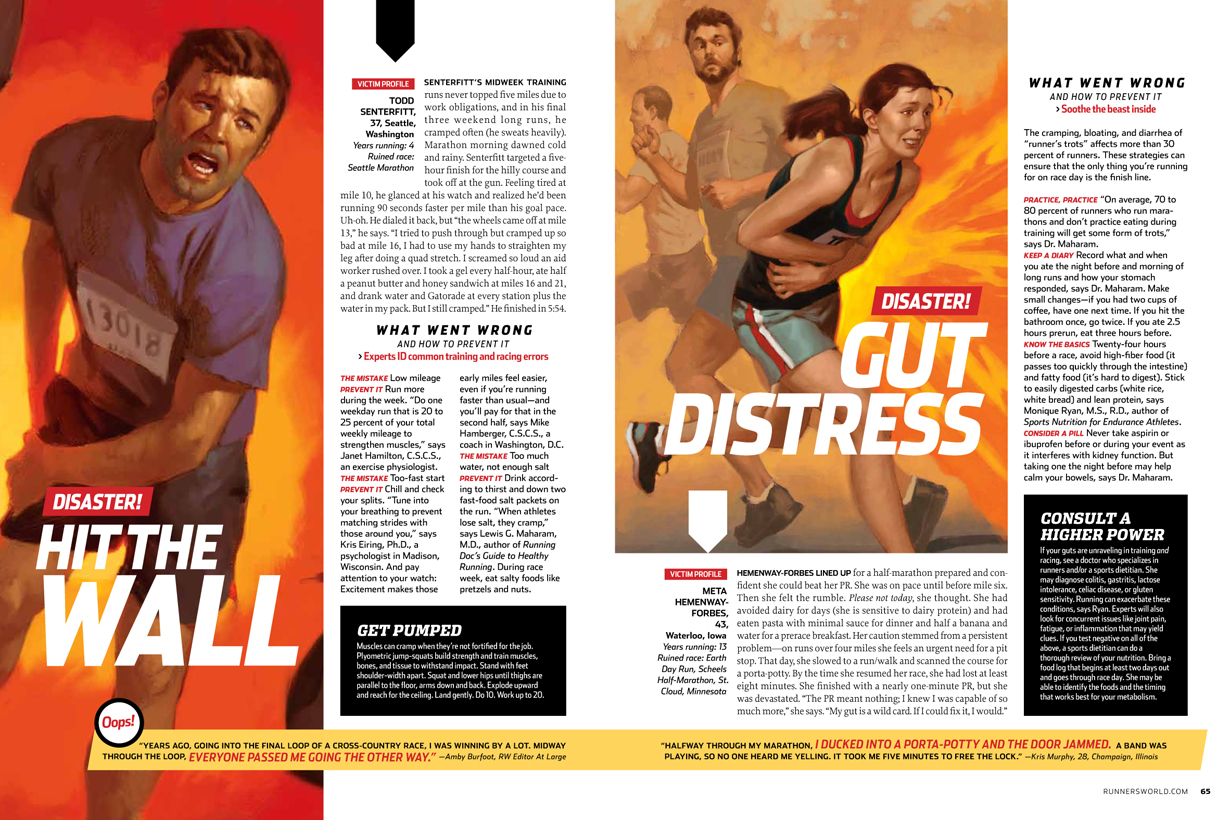
And a couple spreads:
One of things I quickly learned in my first week at Runner’s World is: If a concept doesn’t feel fully developed, try throwing a pair of running shoes on it. Here’s my sketch for the grocery store service feature opener. Deputy Art Director Marc Kauffman threw a pair of shoes on it:


And here’s the opener, photographed by Travis Rathbone: 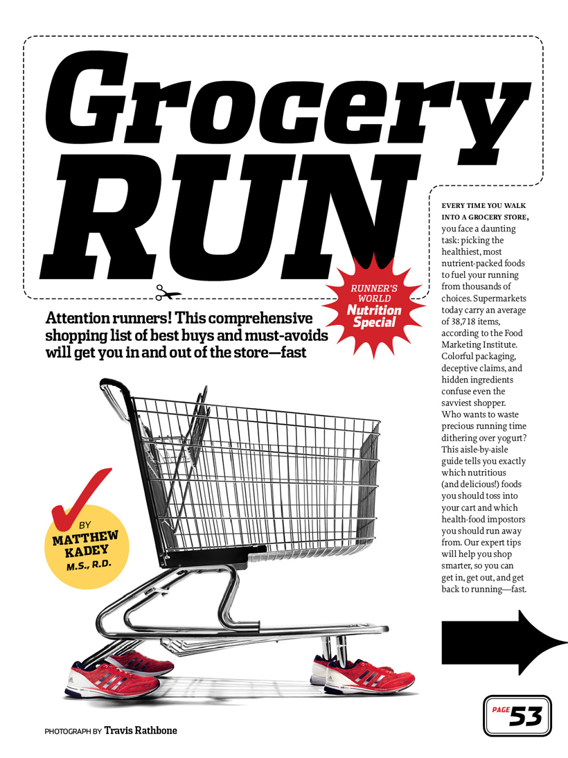
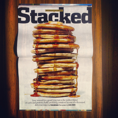
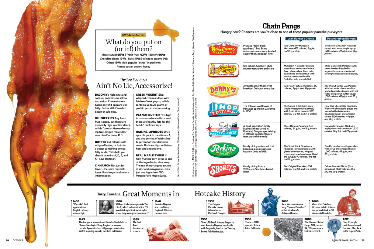
We did a service package all about a runner’s favorite breakfast: pancakes. Lisa Shin shot all the food photos:
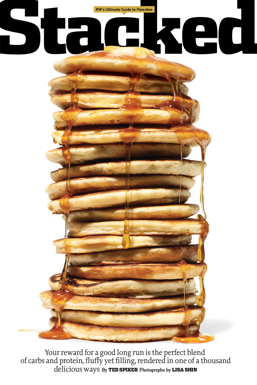 I ran the photo pinup-style, to present the pancakes in actual size:
I love how the bacon shot turned out:
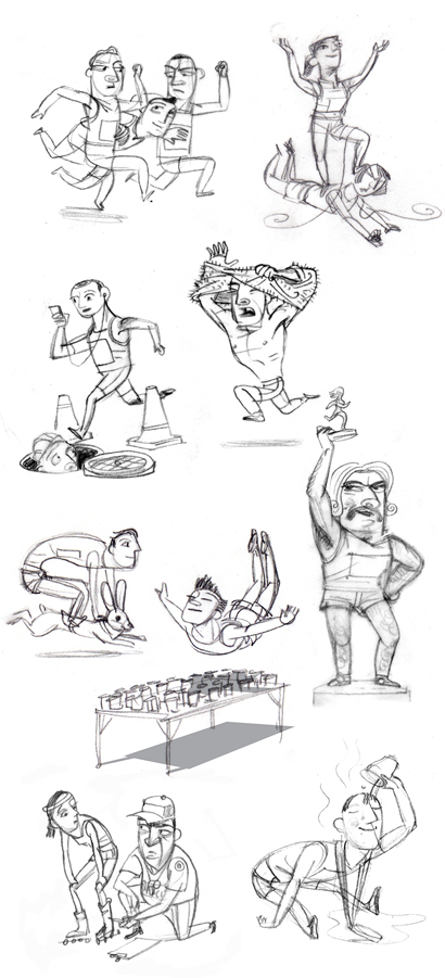
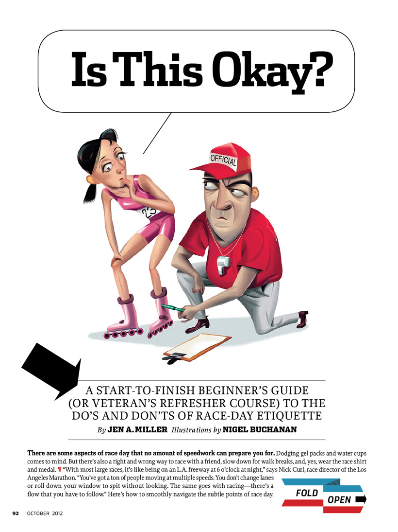
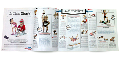
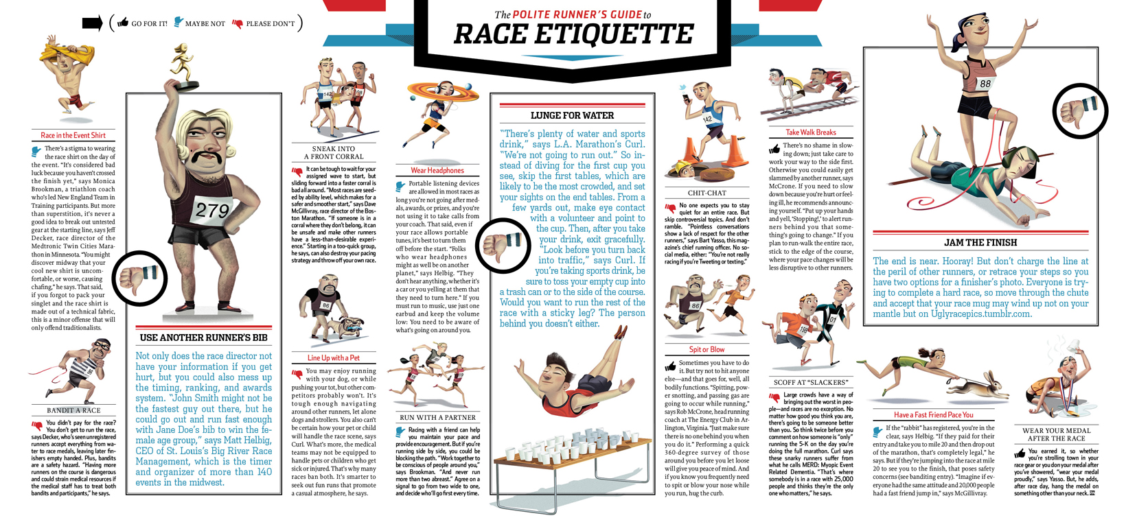
I was happy to bring one of my favorite illustrators into my first issue. Nigel Buchanan did 16 illustrations for the Race Day Etiquette feature. I like to approach illustrators with initial concepts for each spot, and then go from there. I don’t think we really strayed from those initial concepts in this whole package.
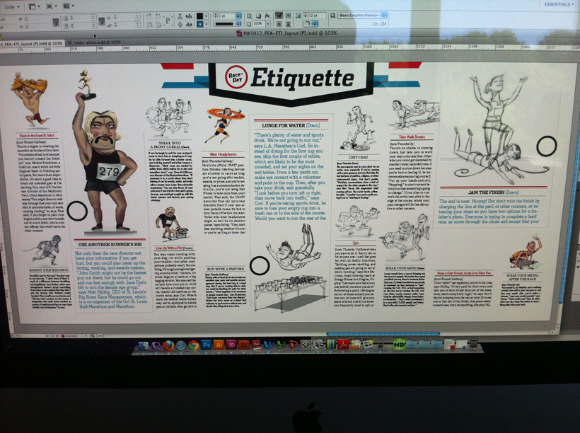
Here’s a snapshot of my screen as I worked with a combination of sketches and finals:
This feature opens on a single page, then continues as a three-page foldout. That’s the first time I’ve designed one of these. Here’s the opener:
Here’s a photo of the foldout:
And a better look at the digital file:
There’s one other feature in the issue, but I’ll comment on that in a separate post. These are all part of the October 2012 issue, in stores now: