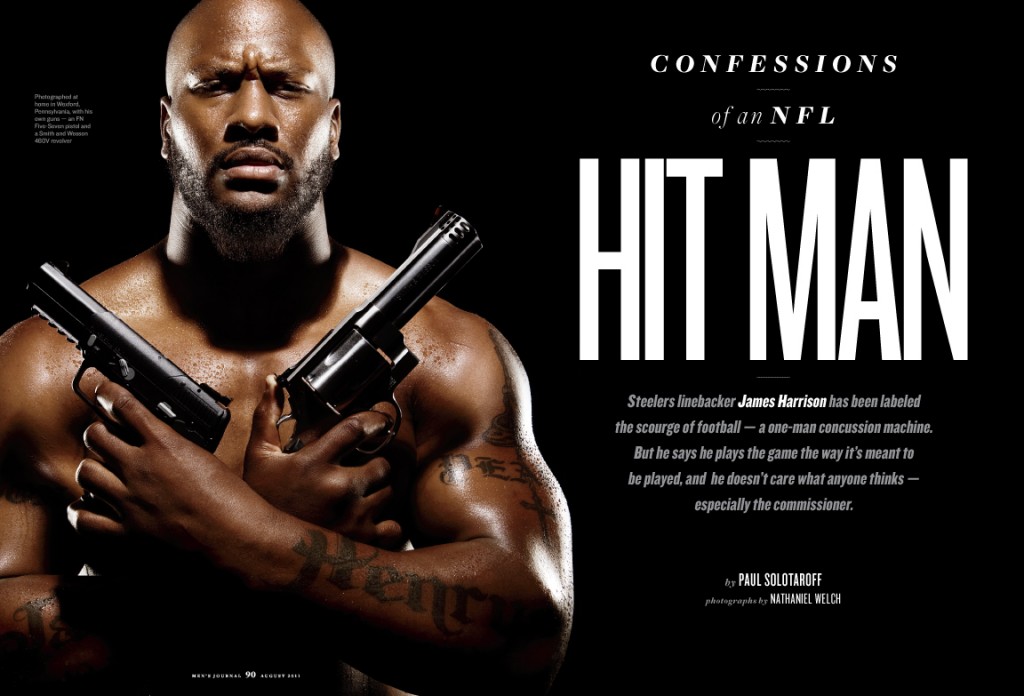
The August issue of Men’s Journal had some great material to work with — especially in the feature well. I knew the explosive James Harrison profile was going to attract a lot of attention as soon as I read it. I wanted photographer Nathaniel Welch to create a portrait that would stop people in their tracks, so he got Harrison to pose with his own handguns for this opener:
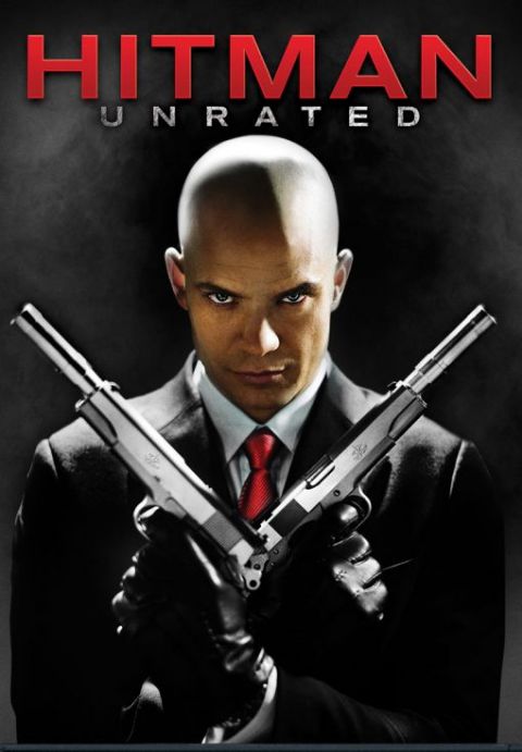
I was really excited to see this spread show up on so many Web sites and sports shows. It’s probably gotten the most exposure of anything I’ve worked on. And it was great to see it discussed on APhotoEditor, which brought to my attention that we’d inadvertently referenced the poster for a movie called Hitman:
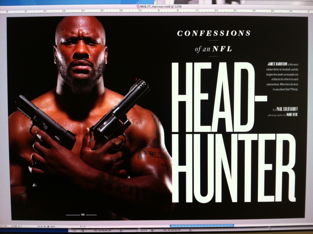
I use the phrase inadvertently referenced because it was completely unintentional; at the time Nathaniel and I read the article and began working on the photo and design — and up until a couple days before it went to press — the story had a different headline. (In fact, as the editors and I were kicking around new headline ideas, I threw out the term Hit Man!) Because I always snap iPhone photos of my monitor so I can look over my work when I’m not in the office, I can share this early draft of the opener:
Had I known James was doing the same pose as the star of the Hitman poster, I don’t think I would’ve even suggested that headline.
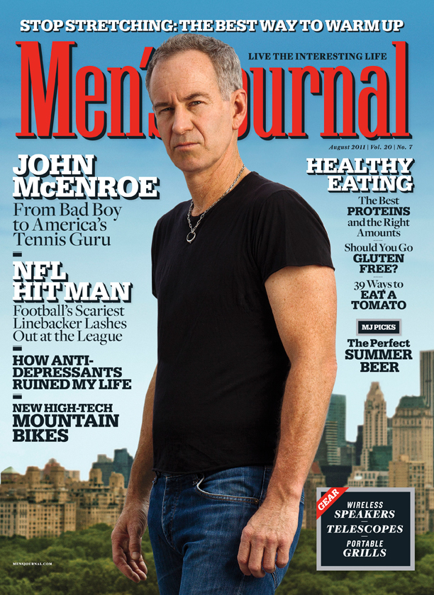
I joined photographer Jim Wright on the rooftop of a building overlooking Central Park for this John McEnroe cover shoot:
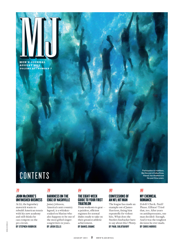
I went for a cleaner look with this redesigned table of contents:
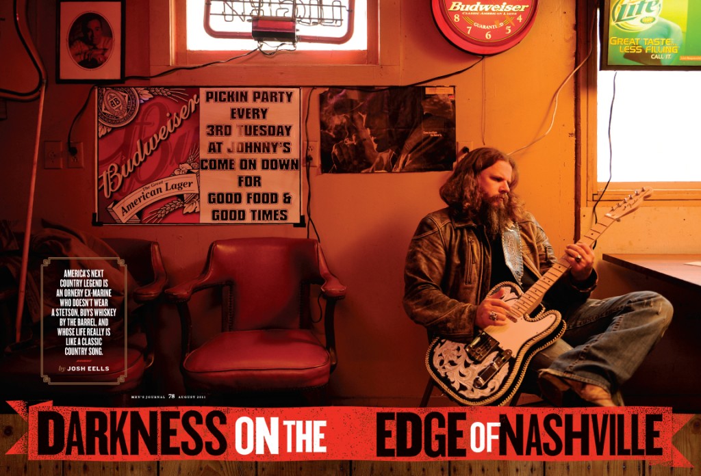
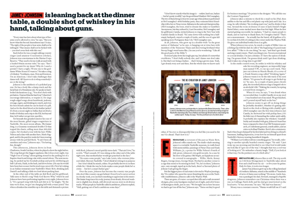
For this profile of country singer Jamey Johnson, I mimicked the look of wood type for the headline and drop caps. And in order to position the photo — which cuts off at his knee — higher up on the page, I set the headline against a wood background.
I also used a wood background for the photo timeline on the second spread, and for the pull quote on the third.
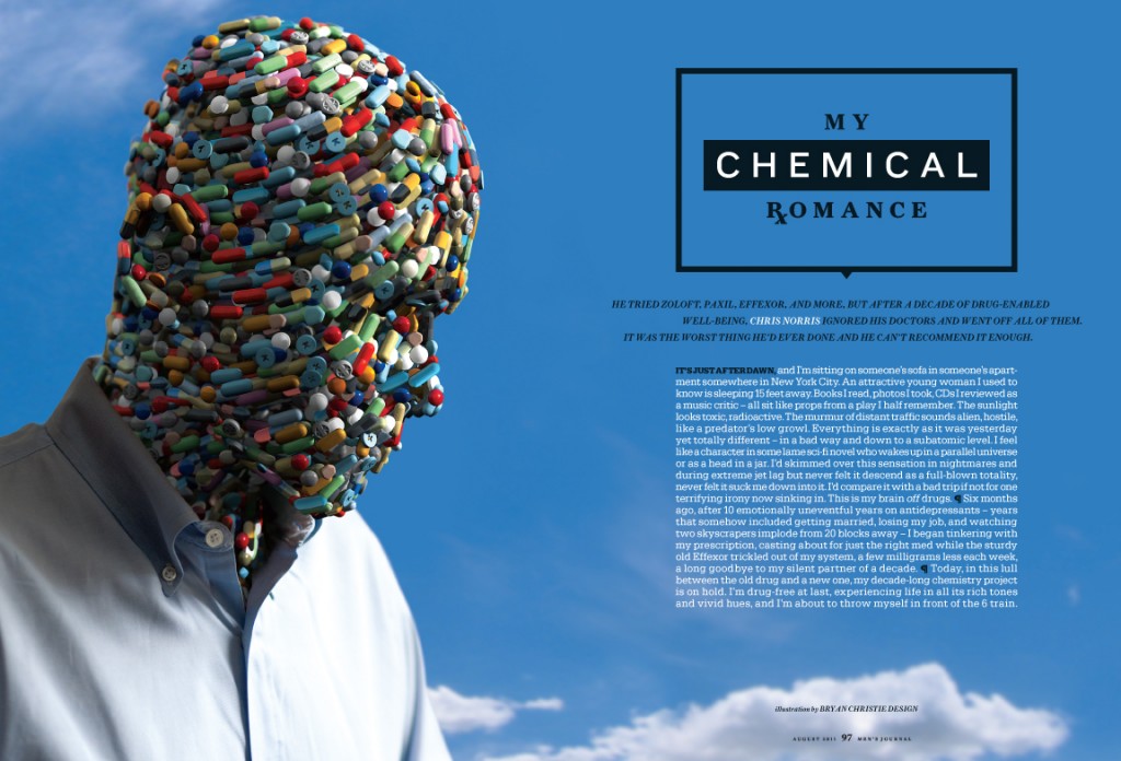
For this personal essay on a writer’s battle with anti-depressants, I had Bryan Christie Design create a man made from the different pills the writer had been prescribed over the years. We changed the headline the night before the story shipped, and as I kerned the new words I had an idea to replace the R in Romance with the pharmacist symbol Rx.
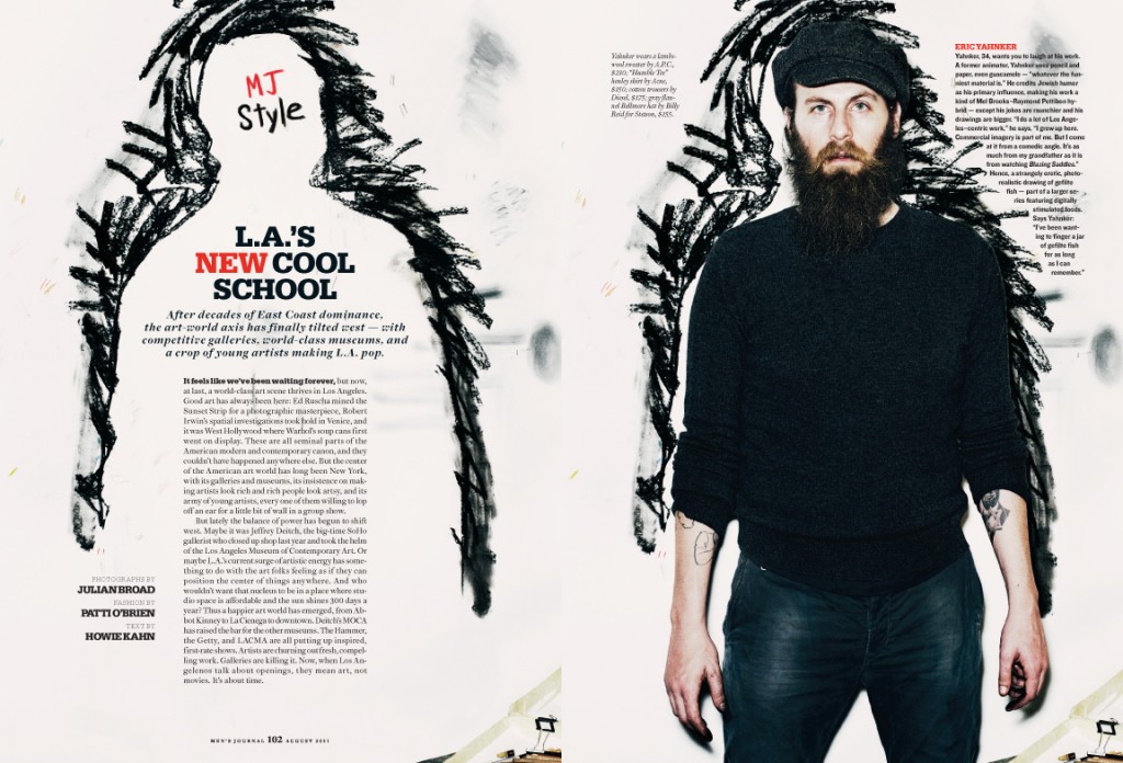
The style feature is my favorite one I’ve worked on. When I saw the photo of this artist standing against an outline of himself that he’d drawn on the wall, I knew exactly how I wanted to open the feature:
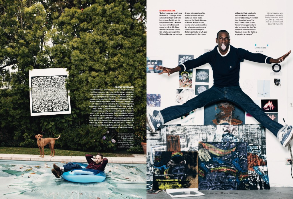
Another spread from the style feature, photographed by Julian Broad:
Yep, August was a fun issue to put together. September’s on stands now, and I’m currently signing off on pages from the October issue. I’ve already got two fully designed November features pinned up on my office wall. The year is just flying by …

