I’m always on the lookout for handmade graphics. Back in April I spotted this hand-painted signage in the window of the tattoo parlor down the street from my apartment:
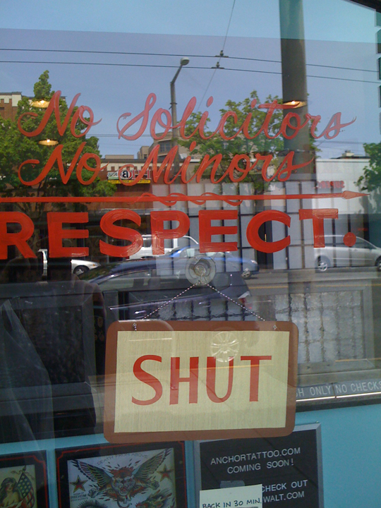
The owner caught me admiring it and told me that a guy in the neighborhood was behind it. I made a note to watch for a chance to use this guy for hand lettering in the future …
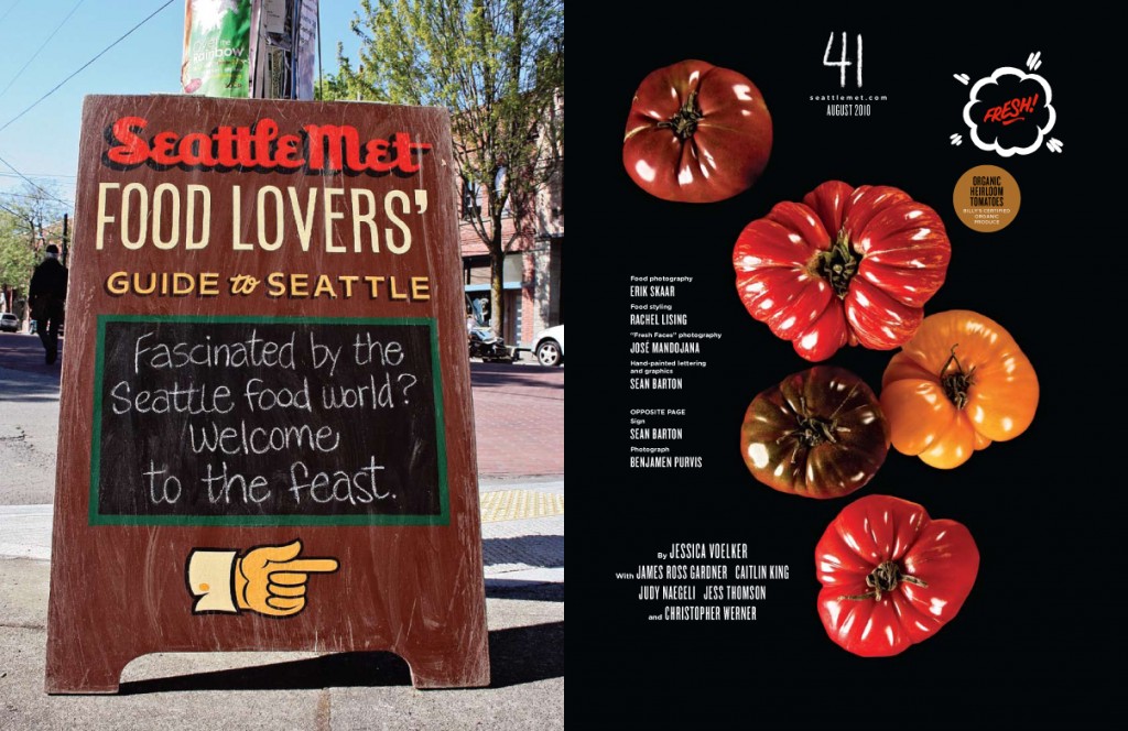
In June, I began work on the August issue of Seattle Met — the Food Lovers’ Guide. With all its emphasis on local growers and DIY aesthetics, I got to thinking about the bars, restaurants, delis, butcher shops and bakeries around here that often have great handmade signs on the sidewalk. Here’s one of my neighborhood favorites:
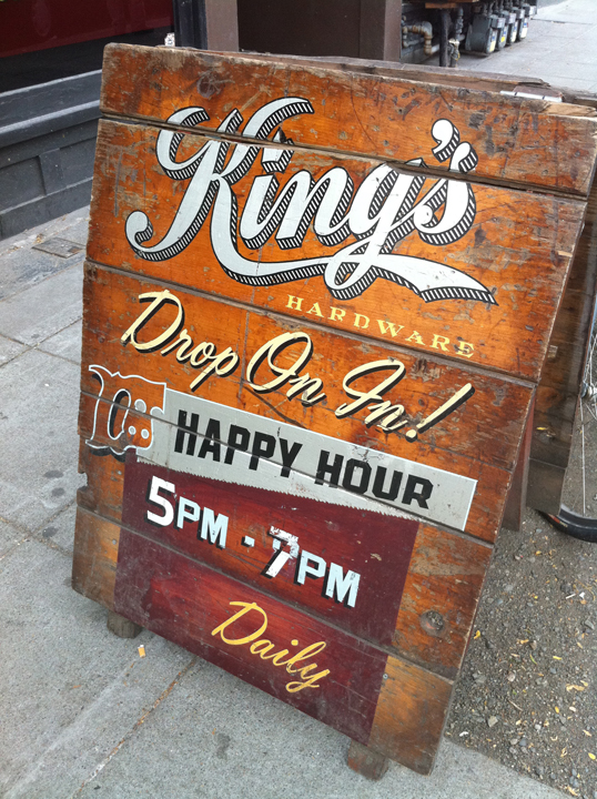
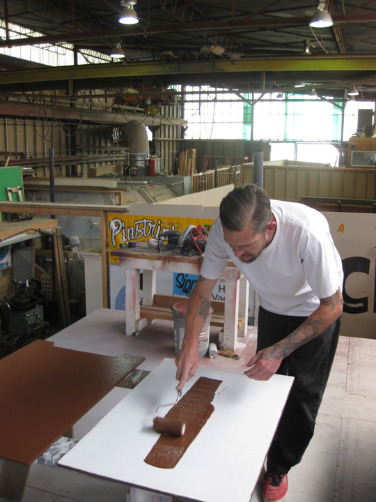
I decided that would be my angle for hiring a sign painter. I went back to the tattoo parlor and got the contact info for sign painter Sean Barton. Sean’s a great guy; we’ve talked for hours about our shared love and respect for the craft. Since his studio is just down the road from my apartment, I walked my dog down there a few times to check his progress and give him feedback. Here he is working on the sign for the Food Lovers’ opening spread, out of his Ballard studio (shared with a vintage Volvo repair shop).
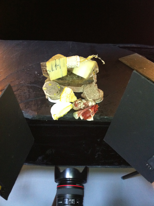
Meanwhile, I worked with photographer Erik Skaar and food stylist Rachel Lising on the cover and food photos for inside the issue. Here’s an overhead shot of what would become the cover image (you can see the photographer’s lens at the bottom of the image). It shows the depth of the setup, and just how important good lighting is in a photo:
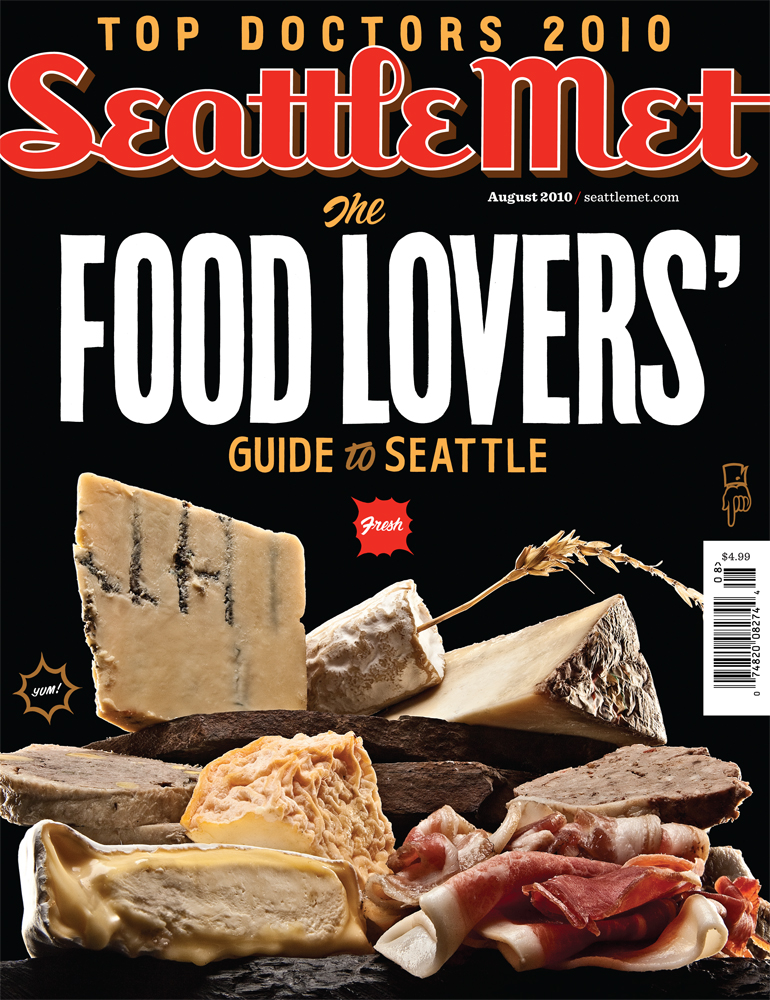
And here’s what the photographer’s lens from that last shot captured, using a strategic lighting setup:
Sean did all the lettering on that cover, as well as the little graphics. My favorite is the hand pointing at the price.
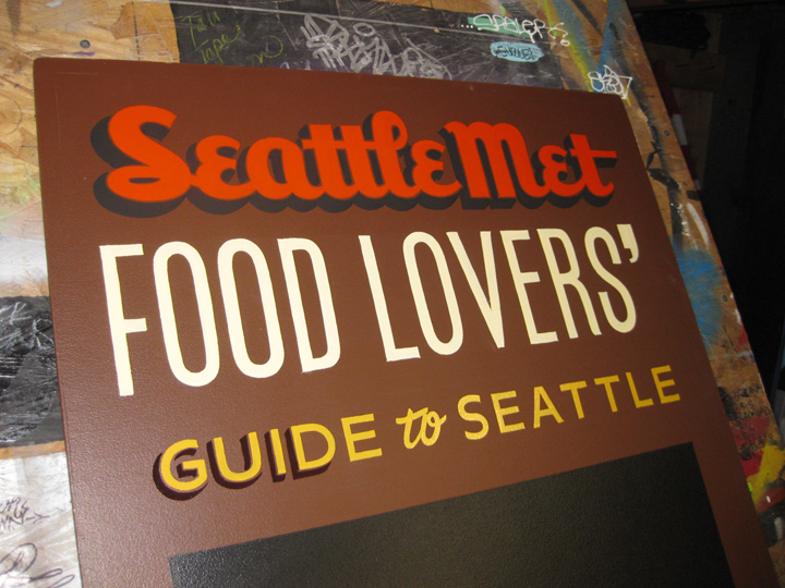
Here Sean adds drop shadows to “Guide to Seattle” for the sidewalk sign:
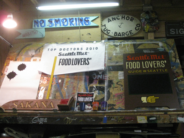
Here’s Sean’s studio, where he worked on the headlines. You can see a little cover mock-up I sent him for type reference. This was before we’d shot the actual cover, so I just used a stock image of cured meats for the comp.
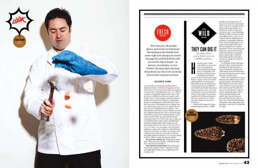
I instructed photographer José Mandojana to use a low-fi setup for his chef portraits. Whereas Erik was lighting his food meticulously against a black background, I had José shoot his people against a white background, and light them as though he was using a camera-mounted flash. And I urged him to play up violence in the photos (the kitchen is filled with dangerous items, after all).
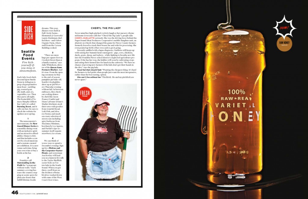
We mirrored the violence in the studio. Rather than just shoot a nice jar of honey, I had Rachel drizzle it into an already full jar, flooding the thing:
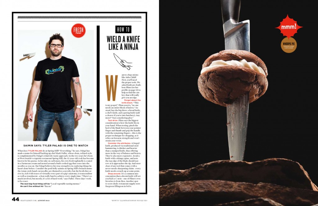
When I saw this whoopee pie as an option for snack photos, I said to Erik, “I’d love to drive a huge knife through that thing, and photograph it just hanging there.”
Here’s how it turned out.
(My intern, Nicole Yeo, illustrated the little hand and knife there.)
Sean finished the sign the weekend of the 4th of July, which in Seattle was gray and rainy. We had a small window of clear skies, so I pounced and used it to photograph the sign myself. First I raked the sign across some gravel by some nearby train tracks, then I set it up in a spot in my neighborhood that has lots of restaurants and foot traffic. When I was photographing this sign, a passerby asked me if it was for a new business opening up. This is the opening spread of the feature.
It was a lot of fun to put together, and I’m really proud of all the components. It’s my favorite service feature I’ve worked on so far.
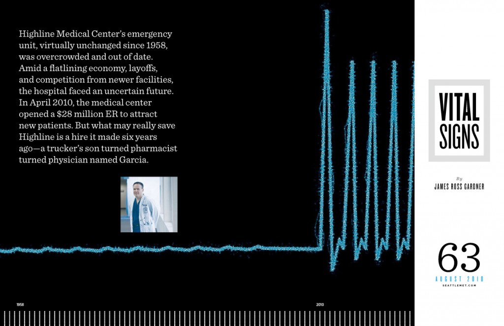
Also in the issue is a feature about an emergency center that recently launched itself into the modern age after decades of stagnancy. I illustrated it myself with this simple (and well worn) heart monitor reference:
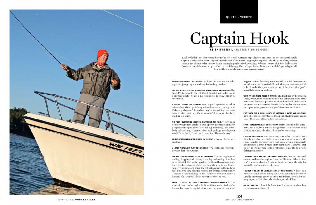
For Quote Unquote, I sent photographer John Keatley into the sea at sunrise with charter fishing guide Keith Robbins. He returned with some shots that supported the idea that shooting a guy in a moving boat from another moving boat (without help) is a hard thing to do:
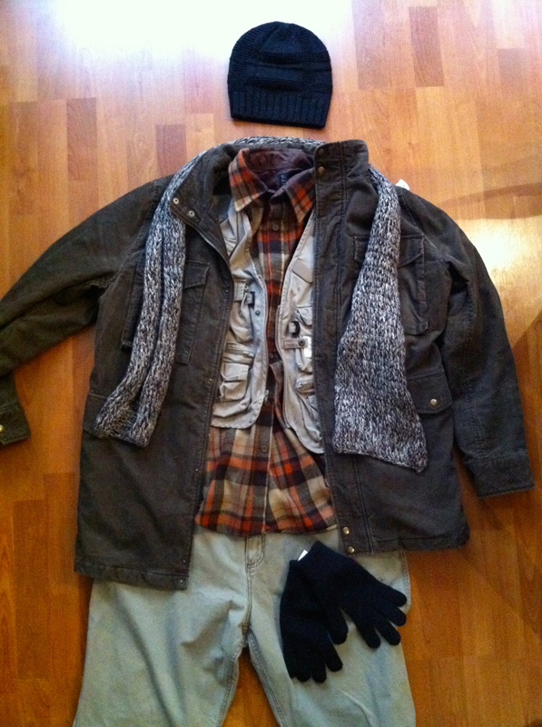
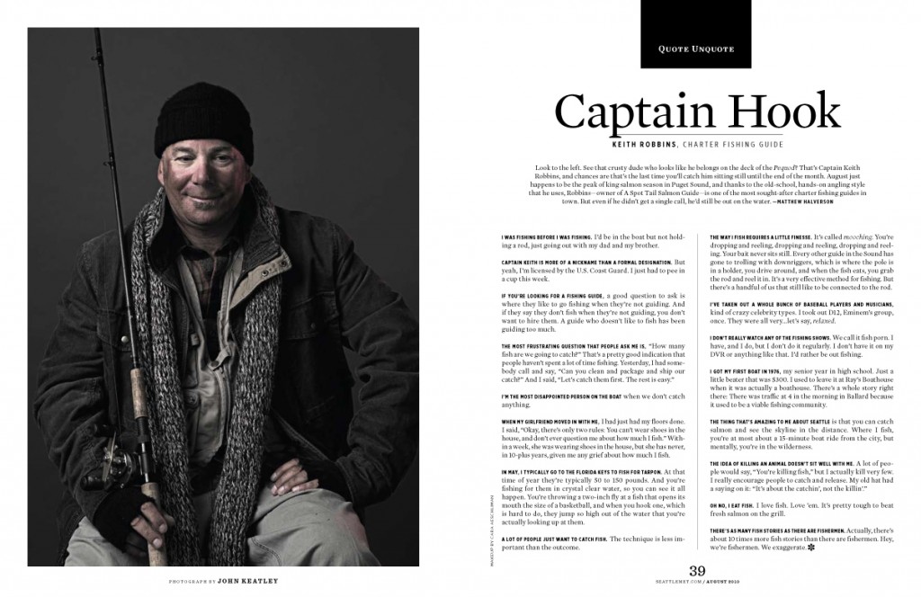
Although I liked the shot when I enlarged it and rotated it like that, it just didn’t feel right for the series (which includes this, this and this). It was the only Quote Unquote shoot I hadn’t attended — if I’d have been there with John, I would have told him to scrap my idea of shooting Keith in his boat when I saw how difficult it was. This is one of the rare times I’ve asked for a re-shoot. I just wasn’t thrilled with the shots, and John — a perfectionist who prefers to control all variables in a shot — wasn’t, either. We decided to shoot it in the studio this time. And I had one more change I wanted to make: I wanted him to look like an old-time fisherman like you’d see on a ship from a hundred years ago. I only had an evening to achieve this look, so I went to Goodwill and put together an outfit that I thought looked authentic. I snapped this photo and texted it to John, who was thrilled.
Here’s how the final photo turned out:
Quote Unquote editor Matt Halverson called it his favorite photo we’ve run in the series, which made me really happy about the decision to re-shoot during production week.
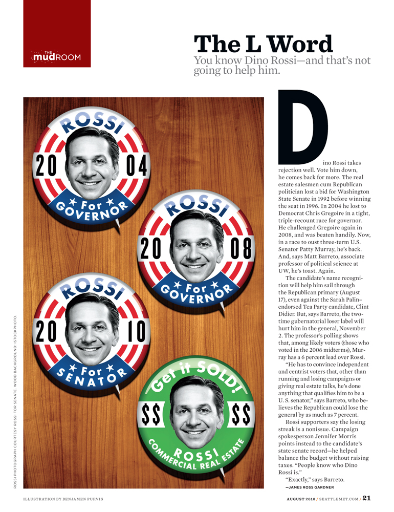
Also in the issue, I illustrated the opener for the Mudroom:
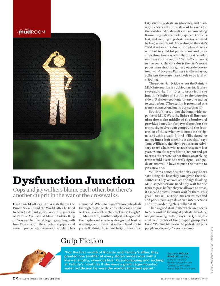
And I did this spot illustration (also during production week) for a story about crosswalk confusion:
I’m really proud of the way the August issue turned out. It’s still in stores for another couple weeks, if you’d like to see the whole thing …
* * *
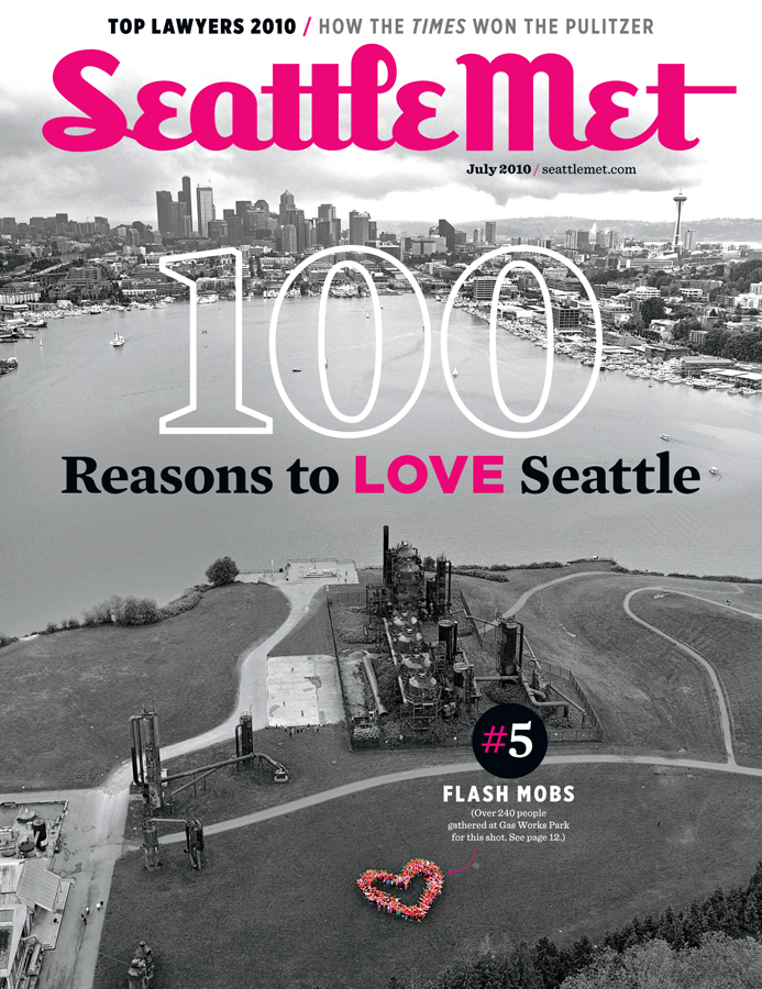
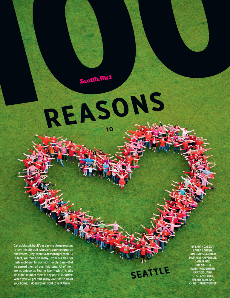
I thought I’d post some stuff from the July issue, since I never got around to it. Here’s the cover, for which I contacted Egan Orion, mastermind behind this video, to help me stage a flash mob:
Here’s a closer look. (Will Austin photographed these from a constantly-moving helicopter.) This is the feature opener.
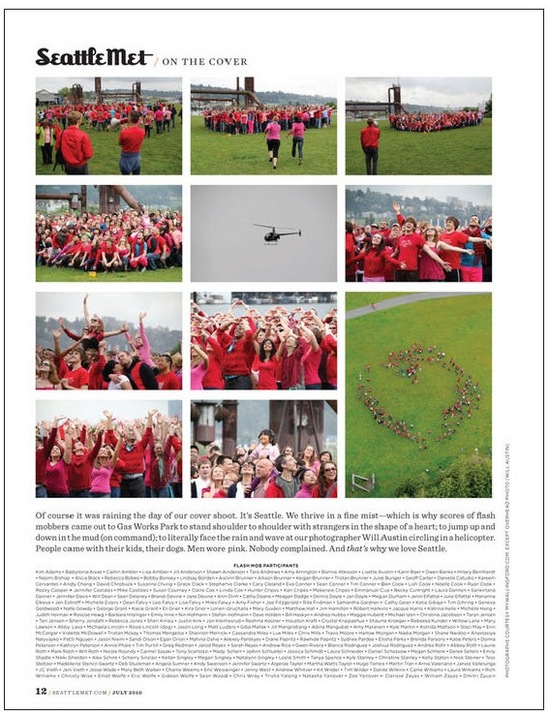
 I included some making-of shots in a special table of contents page, and ran the names of the 200+ people in attendance:
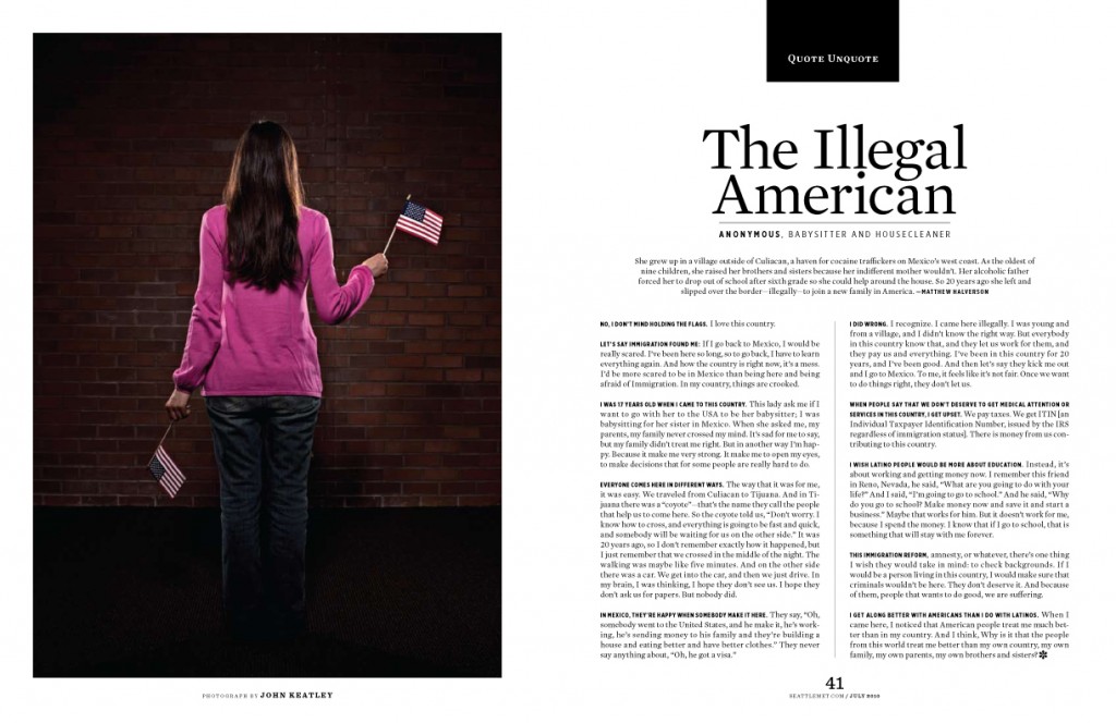
The Quote Unquote profile of an illegal immigrant was tough to work around. It was hard enough to find someone who was willing to speak to a reporter, but harder still to find someone who was also willing to be photographed. I came up with an idea to avoid showing her face, and photographer John Keatley made it happen:
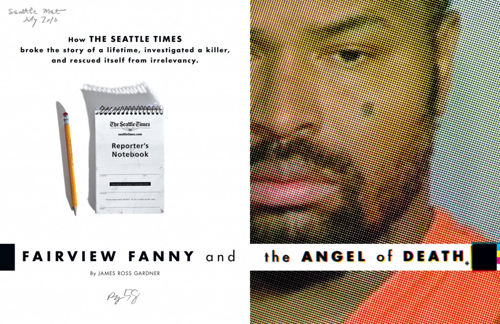
Also in the issue is one of my favorite Seattle Met spreads I’ve worked on. I took this killer’s tiny mugshot and blew it up something like 20 times its size. I kept it sharp by using several different halftone patterns, which were saved as four bitmaps and multiplied on top of one another as cyan, magenta, yellow and black layers in InDesign. Erik Skaar shot the notebook (an actual Seattle Times reporter’s notebook that we battered up). I requested long, crisp shadows for this, to give it a sort of film-noir-in-daylight look. The first shots looked okay, but there was something missing. So I had him chew up the pencil, and suddenly it worked for me.
Those folios are in my handwriting …

