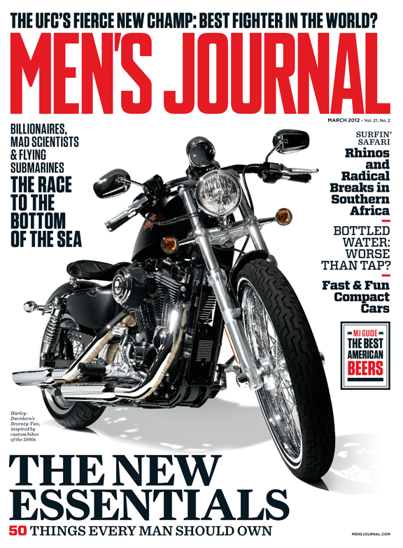
I shared some behind-the-scenes info on the new Men’s Journal logo in this post on the SPD’s site. I included some of our recent work as well.
I’ve been really happy with a lot of the feedback I’ve read online. I especially like this review from UnderConsideration:
The new logo abandons the outlines, shadows, and dimensionality in favor of a bad-ass, bold, and condensed treatment. The combination of hard angles in the “S” and “R” coupled with the barely round corners gives the logo an extra masculine whiff that the previous logos lacked. The tracking and kerning is quite impeccable too and it looks great emblazoned across the width of the magazine’s cover.
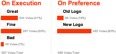
Their poll results [as of 10 PM EST on Thursday, February 16, 2012] are really encouraging, too:


