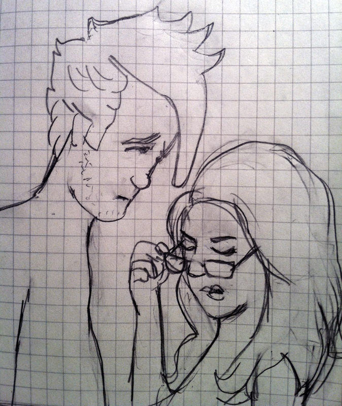
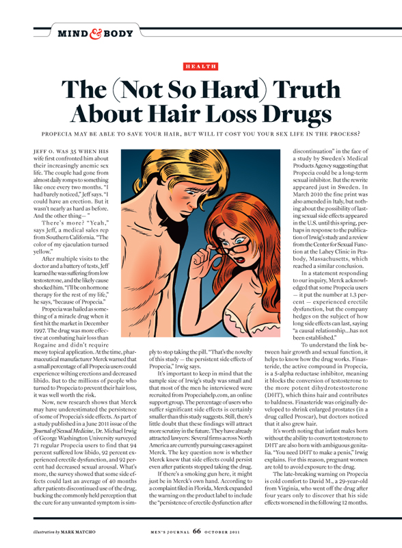
I do a lot of sketching to get my ideas across — it’s often the most efficient way for me to communicate. Sometimes I do a hasty scribble, and sometimes I take a little more time, like in the above pencil drawing I did for Mark Matcho to reference in his illustration for this article on hair loss drugs and their embarrassing sexual side effects:
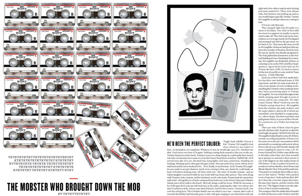
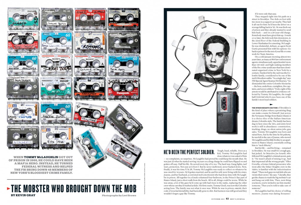
I also sketch using low res photos in InDesign, like in this layout I put together for photographer Levi Brown to reference in his compositions:
I repeated the same photo of a blank cassette with the understanding that a stylist would track down different cassettes on eBay, write the names of convicted mobsters on them, then bang them up a little and wear them down to suggest they’d seen a lot of action. I drew that wire coming from the tape recorder in Illustrator, and made the mugshot in Photoshop (based on a tiny mugshot that was far too small to use). I wanted the photo to look like it had been photocopied and faxed.
Stylist Angela Campos printed my mugshot design and crumpled it to give it some life in Levi’s photo:
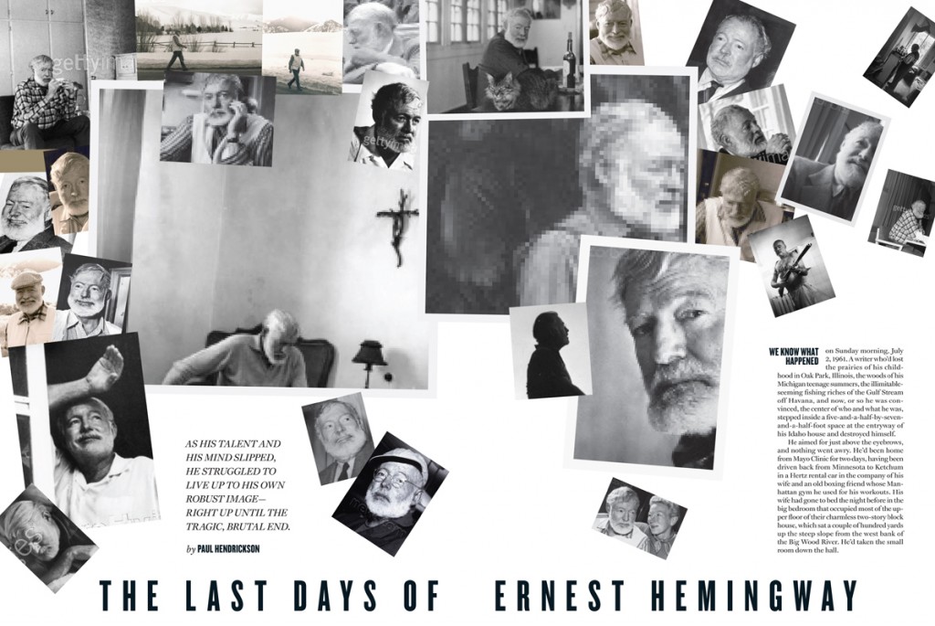
Here’s another InDesign sketch, this time using watermarked photos of Ernest Hemingway.
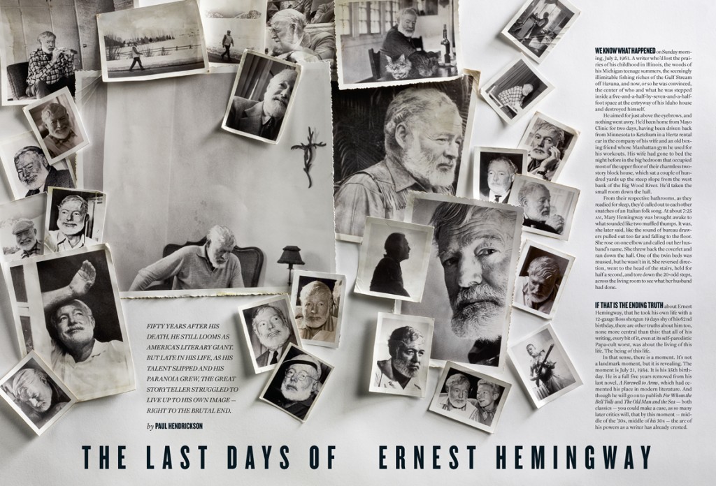
The feature tells the story of the last, paranoid days of Hemingway’s life, which ended in suicide by 12-gauge shotgun. I had an idea for a layout that looked like worn old prints arranged in an awkward, almost violent fashion, and I cropped them so that only Hemingway was in the frame. (With two exceptions: one with his cat, and one with his wife — but in both of those instances I chose photos where he looks disengaged.) The portraits run the spectrum of emotions, and the cropping is sometimes very intimate or very distant.
We printed these on glossy paper, then had stylist Linda Keil age and distress them using watercolors and special scissors. Linda made a collage by laying down her photos on top of a print of my slightly revised InDesign layout (we needed to fit more text on the opener, so I made the photos a little more congested). When I saw Jeff Harris‘s very first shot of the collage, I knew we had our opener:
I have to say, working with photo stylists in one of my favorite parts of my job. I love seeing them execute my ideas in better ways than I could.
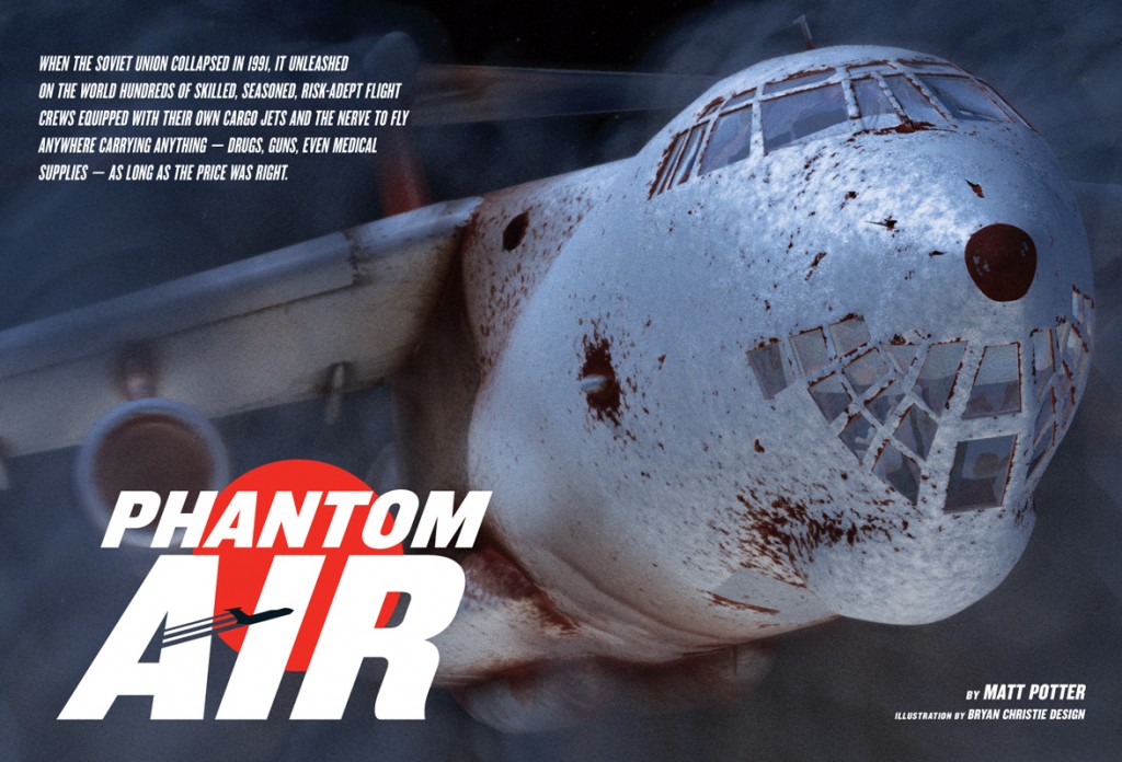
Here’s a feature opener for a story about global smugglers. I designed the headline as though it was an airline logo, and Bryan Christie Design illustrated a rusty old Russian plane emerging from the night fog:
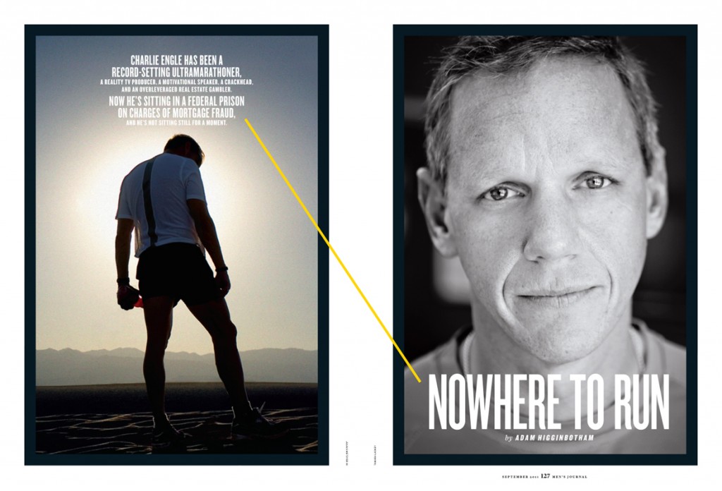
Here’s another feature opener made up of archival photos. Unlike the Hemingway feature, though, there weren’t many to choose from here. But I think the pairing of these two gives them a dramatic narrative quality:
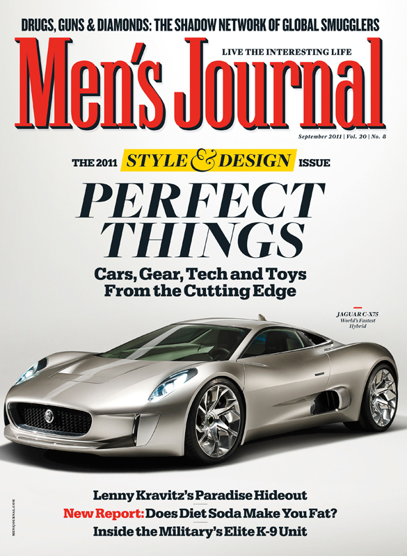
Here’s the cover of the annual Style & Design issue, which is not presented on a white background for the first time ever. Photographer Trigger shot this in Banbury, England. I didn’t get to attend that cover shoot, unfortunately:
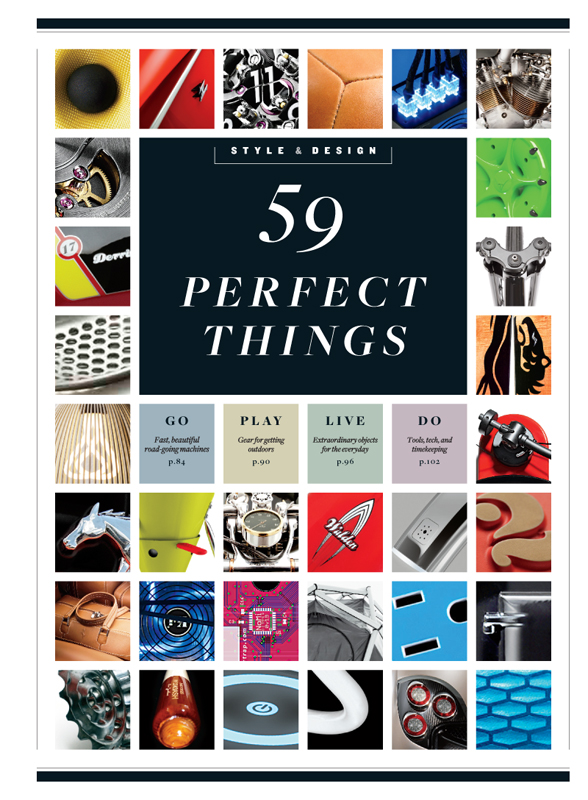
We opened the feature with a TOC and a grid of extreme close-ups of the products that followed:
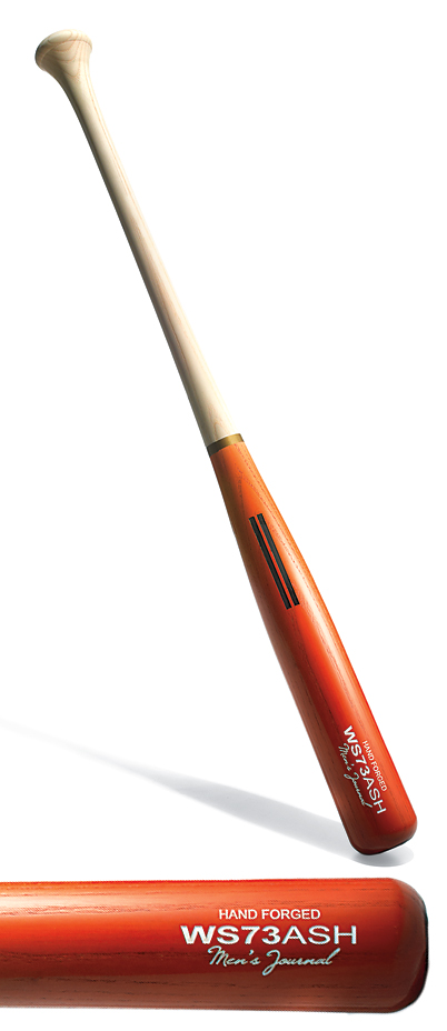
I wound up buying one of those products we included — the old-school baseball bat on page 94. If you look closely, you can see that it’s engraved with a Men’s Journal nameplate:
