Back in October of 2006, I started thinking about a dotted “light bulb font” for my forthcoming redesign of Las Vegas Weekly. I was hoping to make the redesigned magazine as uniquely regional as possible, and lights are obviously a big part of the Vegas identity.
As a graphic designer, I’m a devoted student of Esquire magazine. Over the last five years, it’s been my single biggest design influence. And when I imagined my custom light bulb font, I pictured it being based on Esquire‘s Stag font, designed by Christian Schwartz. So on October 26th, 2006, I put together a sketch for my Stag dot font idea and sent it to Christian, to see if he’d be interested in helping me create a fully functional font set out of it:

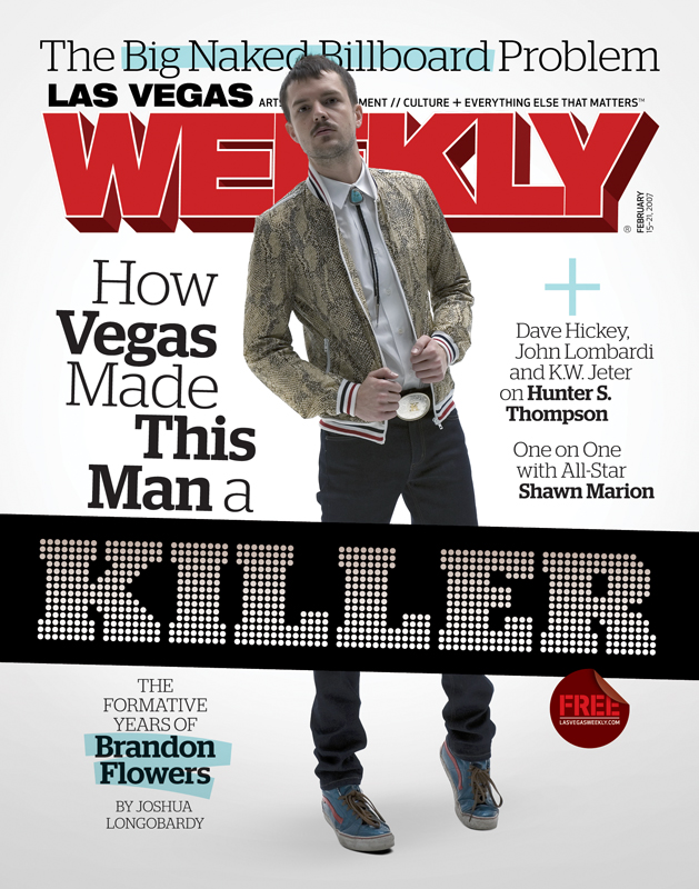
Christian was into the idea, and he started playing around with other letters. We determined the number and thickness of dots to be used in each character, along with the spacing between the dots. Christian took this info and went off to work on the font set while I worked on the magazine redesign, and on February 1, 2007, Stag Dot Bold and Black made their debut in the freshly redesigned Las Vegas Weekly.
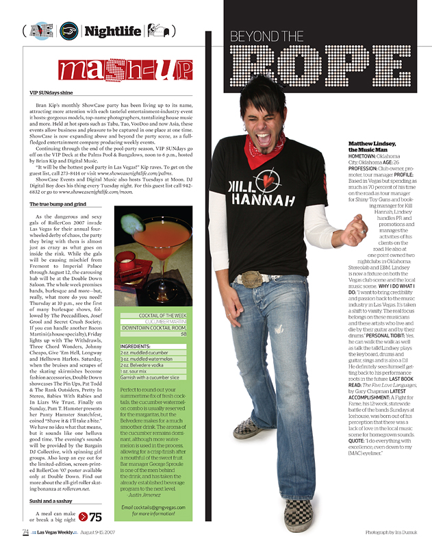
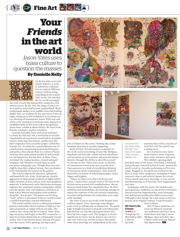
Since then, it’s turned up all over the publication:
A couple months after I debuted it in the Weekly, Christian asked me if I’d be cool with him selling Stag Dot to the public. Of course I was fine with it, but the truth is, I never imagined anyone else would want it for anything. I just thought it was so specific to Vegas …
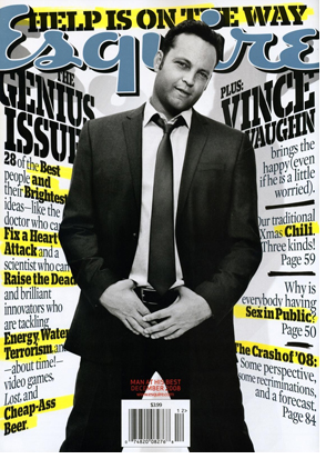
So imagine how thrilled I was this morning when I flipped open the December 2008 issue of Esquire and saw the font that I conceived and commissioned for Las Vegas Weekly:
There it is, in Esquire—a magazine that I learn from and hold in such high regard—a little over two years after I first sketched out the idea. It honestly made my heart skip a beat, I was so excited. And it’s funny and special to me that they debuted it in, of all things, The Genius Issue:
