I’ve been polishing up my portfolio website, taking better advantage of Clickbooq’s Flash options, and adding work I’ve done in the past 16 issues of Seattle Met. I still have a lot of work to do, but I’m happy with the way it’s turning out.
And I’ve finally updated my WordPress template for this blog from the basic model (which I used from October 2008 until late August 2010!) to this customized version of Twenty Ten.
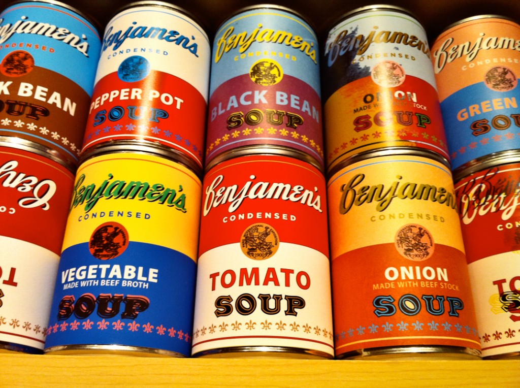
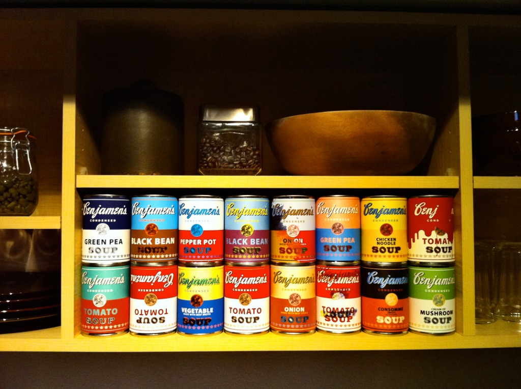
In case you’re wondering about all the soup cans in the header of this page, those are Warhol-inspired labels I made specifically to add some character to my kitchen’s exposed shelving. Here’s how I did it:
I started with these cans of Target brand tomato sauce. At 48 cents each, they were about a third the price of the cheapest can of any Campbell’s product in the same size.
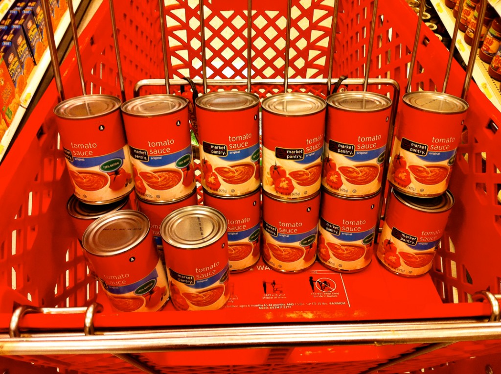 I used the standard red and white can as a base model, but drew heavily from these colorful Warhol prints:
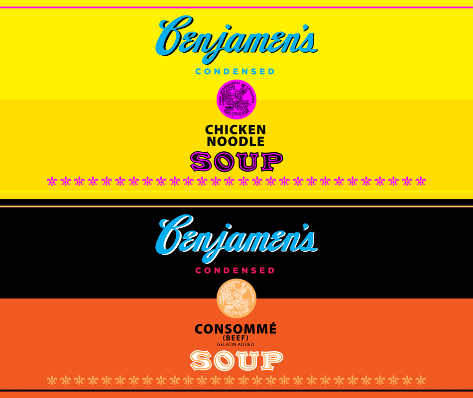
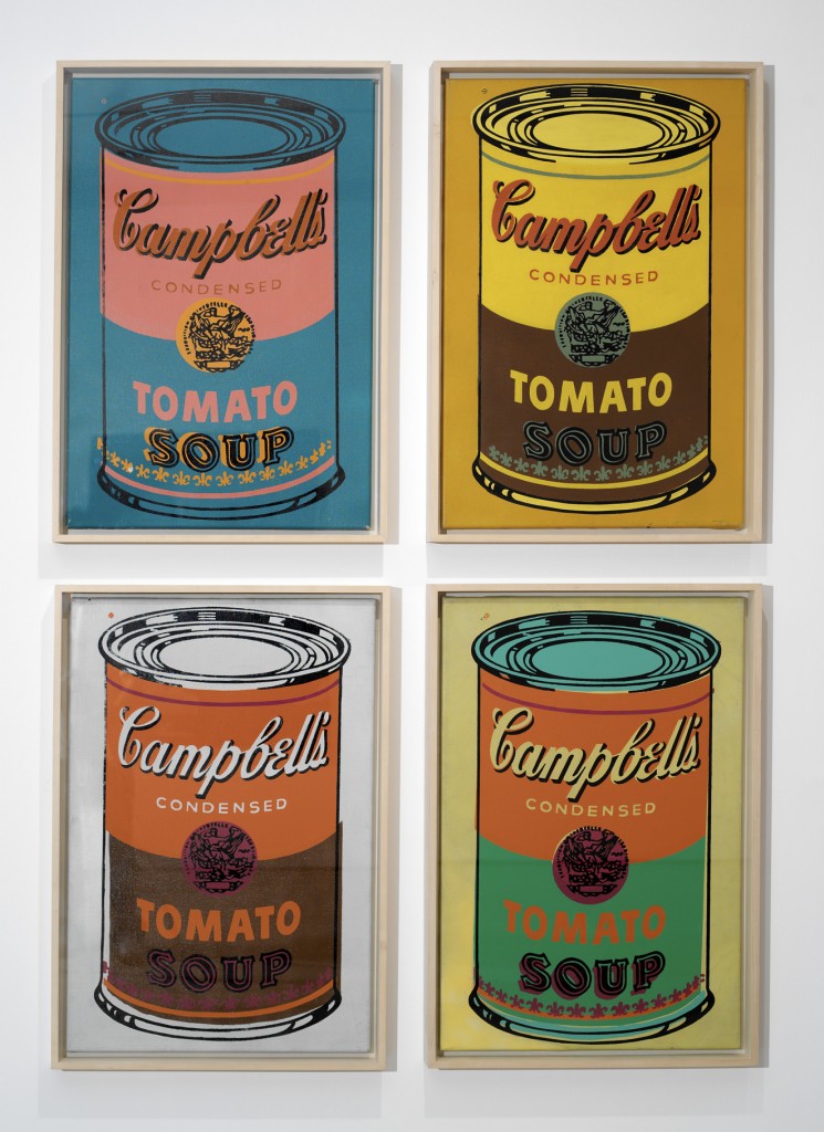 I modified the Campbell’s logo to say Benjamen’s, then traced the circle seal and the word Soup in Illustrator. I used Gotham and Myriad for my live text.
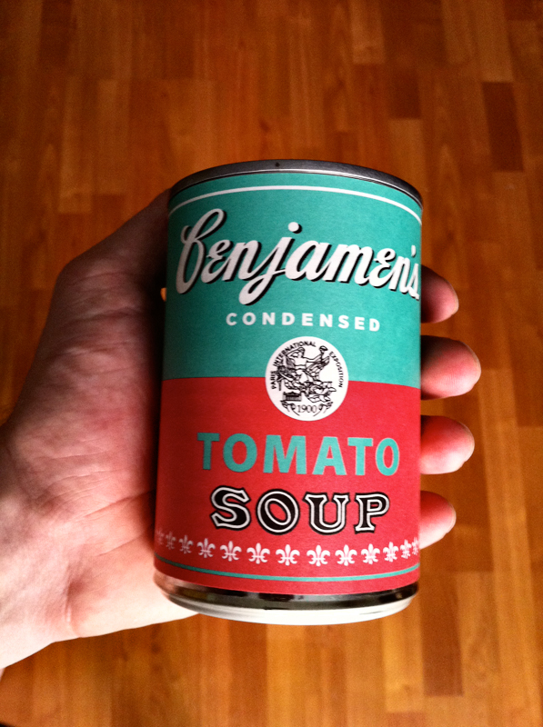
Once I settled on some designs, I printed the labels with my Epson Stylus R800, then laid down some double stick tape and wrapped them around a total of 16 cans. Here’s how my first one turned out:



Any chance you could email me your template for your can labels? I love your use of color!