It’s been a long time since I’ve been able to update my blog. I’ve been working like crazy just to get the magazine out every month, and haven’t had the time to do much else.
Here’s some stuff from the September issue of Seattle Met:
I continue to experiment with the logo (it used to appear exclusively in white, with a heavy drop shadow), and the way in which secondary cover lines are presented (they used to appear exclusively in a black bar along the bottom of the page):
(This 2008 cover shows how the logo and cover lines were typically treated:)
I tried out a different way of opening the Mudroom in September:
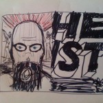
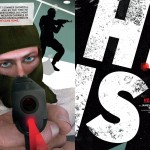
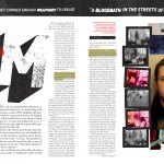
I sketched out this opener idea for the bank heist feature and sent it to illustrator Justin Wood:
And here’s a Nigel Buchanan Back Fence illustration that I really love:
And now some stuff from the October issue, which is still on stands for another couple weeks. Lindsay Borden shot the cover and feature photos for Best Restaurants:
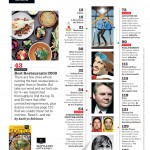
I threw in a little Norman Bates shadow at the bottom of this TOC page, whose design continues to evolve. I made Norman by tracing some guy’s Halloween costume in Illustrator, then blurring it in Photoshop.
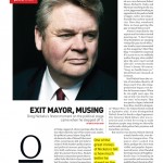
For this article on Seattle’s departing mayor, I asked photographer John Keatley for candid outtakes from a portrait session he shot for Seattle Met a year ago. I thought this one seemed appropriate.
(We’ve been running a fake defaced campaign poster for the mayor ever since my first issue back in May. Here are a couple of my past illustrations:)
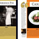
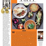
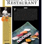
Some pages from the Best Restaurants feature:
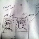
I read an early draft of the feature on rival local weathermen, and took from it these facts: one guy favors snow in his forecasts, and the other guy is a troublemaker. I sketched out this idea for the opener and sent it off to John Keatley:
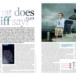
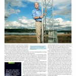
We couldn’t ask the guys to pose together, because their rivalry is bitter and real. But my idea was to have the guys dressed for totally different weather in response to the exact same environmental conditions. So Keatley set up the same shot at two different locations, and I lettered the headline by hand:
I’m really happy with the drastic difference in weather in these two shots. I love that about Seattle:
My designer Melissa and intern Anna collaborated with me on this one. They did the sketches in charcoal pencils, and I did the layout and compositing and chalkboard effect in Photoshop:
Another fun Nigel Buchanan Back Fence illustration:
Lots more design changes in the November issue, including more attractive folios, section openers and listings pages …











It all looks fantastic. Good to see what you are working on.
All looks great, man. The Heist spread rocks.
Everything looks awesome Ben. It’s really too bad that most of the “design” for ads in the mag totally suck. They need to impose some sort of editorial standards on those.. but I guess ad revenue is ad revenue. 😉