The Best Bars cover story has an emphasis on classic drinks, so I suggested that our cover should reference classic handmade graphics typically associated with matchbooks, napkins, coasters, etc. I commissioned illustrator Eric Larsen for the job, and described the kind of look I was going for. His first attempt is a fine illustration, but it just wasn’t right for this:

His next version is closer:

I drew some suggestions over it, and Eric refined and refined, and eventually we got here:

I colored it myself, just because I wanted to be able to tweak it right up to the end. And I added a background:

Eric also illustrated part of the feature opener:

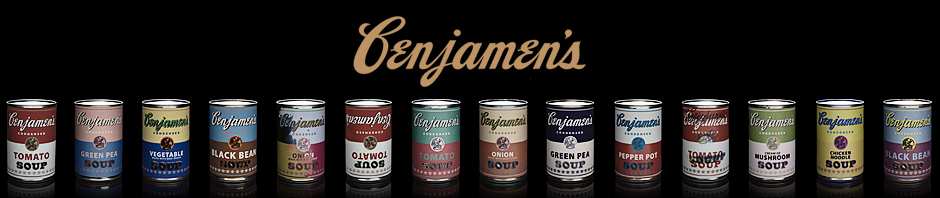
Here’s another feature opener, photographed by John Keatley:

My first big project for my debut issue was to tweak the appearance of the magazine’s news section, the Mudroom. (We’re using the term tweak, not redesign, to describe the changes. We’ll do a real redesign down the road.) I gave the section a new logo, new headline and paragraph styles, and a new color palette:
This is a scan of an old comic book cover:

My buddy Jerry Miller illustrated this one:

Ming Doyle illustrated this one (I clipped out the ads):

And I illustrated this one:

The June issue has even more design tweaks.


Nice, man. Keep on posting the highlights each month.
That looks so awesome. Vegas misses you!