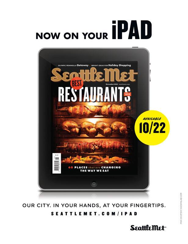
I don’t often work on ads, but I couldn’t resist designing this full-pager for Seattle Met for iPad.
I got that great iPad vector graphic from KaishinLab, modified it a little in Photoshop, then added the November cover (photographed by Lindsay Borden). I spent way more time on the typography than I’d expected to — and even worked in Snyder Speed, a font I’ve been using ever since my days as a Las Vegas Weekly ad designer. (The word “Available” is set in Snyder Speed.) I guess I was just excited to be doing an ad again, for the novelty of it. Too bad it got pulled for space at the last minute, and never got published …
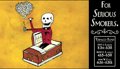
This got me thinking about a few things I designed about ten years ago, when I was starting out as an entry-level ad designer for the Weekly. The first one’s for a smoke shop called Tobacco Road, whose ads were always littered with starbursts and logos and drawings of pinup girls. I came up with an idea for something totally different, and stayed late at the office one night to draw it and design it on my own time.

(All I seem to have from my days as an ad designer are these really tiny files, unfortunately.)
The ad department thought it was really smart and funny, but they were afraid it was too dark: An ad for a smoke shop that’s presented like a solemn funeral announcement — and the corpse is still happily smoking in his casket? Not in Las Vegas, you don’t!
It took some time, but they eventually pitched it to Tobacco Road. To our surprise and delight, they loved it. But they wanted an addendum: Since the holidays were approaching, they wanted the skeleton to be wearing a Santa hat. I thought it confused the message of the ad, but I was really excited to see it printed, so I agreed to add a Santa hat.
And they had just one further note: Replace the smoker’s cigarette with a bong.
I’m embarrassed to say that we ran it that way: A corpse in a Santa hat, smoking a bong. (And with an ugly, out of place Tobacco Road logo slapped on it.) I guess he was the first mall Santa in history to get lung cancer from marijuana …
It won an award at the Nevada Press Association the next year, but by that point I was ashamed of what it had become.
* * *
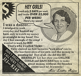
Here’s one of my absolute favorite ads. I used to have to design display ads for the adult classifieds all the time, and it was always the same thing: A close-up of a body part, or a vector silhouette of a girl’s body, or some low-res photo of a trashy model.
One Friday I started working on another one of these ads, with the same old copy and notes for art. Just for fun I decided to design it as though it were from the 1950s, complete with retro photo (this woman is a nurse from a CD of 1950s stock images) and an old-sounding name. And I rewrote a lot of the provided copy, turning it into this perky little thing:

HEY GIRLS! I work only 2 DAYS per week, and I make OVER $2,000 PER WEEK! Here’s my secret!
I was a dancer … I trudged to work everyday and busted my butt, only to watch my money go straight to my boss! One day I had enough of the crap! I wanted to work for ME!
That’s why I called Vicky. Vicky showed me how lucrative “web sites” can be. She has three sites of her own, and the money is pouring in! Best of all, she did this BY HERSELF! Let her show you ONLINE GIRLS and DANCERS how to make great money, without the hassles you’re used to! It’s terrific!
— Miss Loretta Majors
I expected the client to freak out, but they thought it was hilarious, and decided to run it just as I’d designed it. It sure looked eye-catching and sweet surrounded by all those smutty adult ads.
* * *
Finally, an in-house marketing campaign I thought up during slow days at the office. It started out as a way to teach myself how to use Illustrator, and became this offbeat little series that ran for the next year or two.
This first one encourages readers to form a band in Las Vegas Weekly‘s Music Classifieds section. (I was obsessed with retro typography and design at the time. Check out my logo for the Classifieds section at the bottom of these ads.)
This debuted in the summer of 2001:

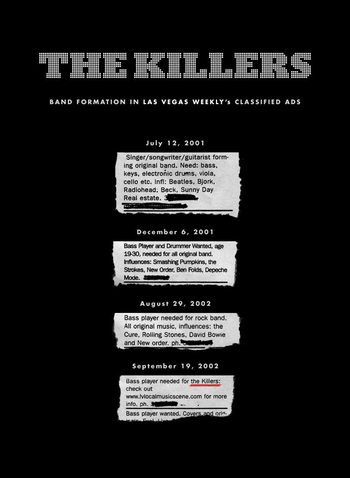
Strange but true: the guys who would go on to become the Killers began running ads to form a band soon after this series debuted:
And here’s the companion to the “form a band” series:

This campaign won first place for in-house marketing at the Nevada Press Associtation the year after it debuted. And every time one of these weird ads ran, I thought, I can’t believe I’m getting away with this.


