While waiting for an oil change in the Jiffy Lube sitting room this weekend, I flipped through a copy of the latest ESPN the Magazine. I’m not a sports guy, so I don’t really look at ESPN for entertainment. But when I first started art directing Las Vegas Weekly, I subscribed to ESPN just for the great design. I borrowed the idea of presenting columnist mugshots in threshold form — which I did from 2002 until 2007 — from ESPN the Magazine.
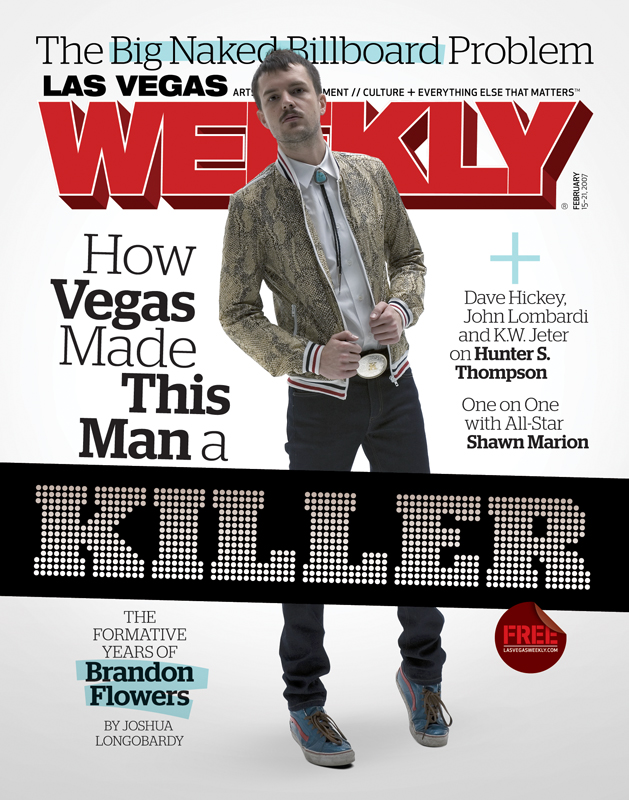
So I was ecstatic when I thumbed through the latest issue and discovered that they’re now using Stag Dot Bold, the font I commissioned in late 2006, for my 2007 redesign of Las Vegas Weekly:
Here’s the sketch I sent to designer Christian Schwartz almost four years ago, to see if he’d be interested in building me a “light bulb” typeface:
Stag Dot Bold/Black made its debut three months later:
The first time I saw it used elsewhere was in Esquire, in December of 2008:
 It’s always a thrill for me to see Stag Dot Bold used outside of Las Vegas — and especially in publications whose design inspires me. I’m really proud that the font still has a life today.


