At the beginning of February I received an email from Julie Ansiau, a French photographer, artist and mom living in Paris. Until then I was unaware of her work, but as a big fan of Pop art, I immediately fell for her hand embroidered “popquilts”:


Julie Ansiau
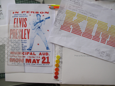
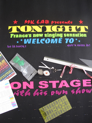
She told me she’s participating in a contemporary art fair in Paris this June, for which she planned to embroider a fake concert poster on felt. She wanted to reference vintage Vegas programs, and was hoping to set the headline type in Stag Dot, the font I commissioned for my 2007 redesign of Las Vegas Weekly.

My original sketch for Stag Dot, 2006
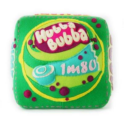
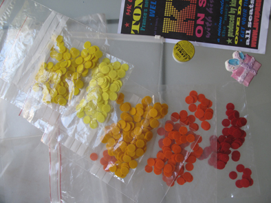
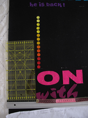
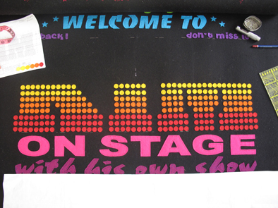
Although typographer Christian Schwartz now sells Stag Dot, Julie was working with a tight budget, and didn’t want to spend $75 to use just three letters. Eager to see what she’d do with it, I happily sent her a copy to use for her piece. Two months later, Julie sent me a photo of the final product, and was thoughtful enough to include behind the scenes shots of the making of her newest popquilt:


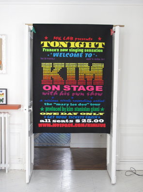
I love it! I’m honored to see Stag Dot in Julie’s work. And I feel so flattered that other people found a creative use for a font I honestly thought wouldn’t have a life outside of Las Vegas Weekly. I’ve now seen Stag Dot in Esquire, on the cover of Bostonia, and as the logo for BBC radio personality Terry Wogan’s website. I get a thrill out of it.


thank you benjamen this is really good spirit-good vibes…
I can feel your amazing karma even from here ! marvellous.
long life to pop ! grateful julie